

Note from Adam: I asked my friend Beth to write up a guide through her process. I’ve known Beth for over a decade now (time flies!) from our days in Grad school at DigiPen. She’s a talented artist and I’ve been consistently impressed by her pet portraits which have such amazing artistry and character to them. I would highly recommend giving her Instagram a follow (@sit.stay.sketch) and visiting her website (Beth Reidmiller). I hope you enjoy this fascinating look at her process. 🙂
Written by Beth Reidmiller
Hello there! My friend and fellow grad-school-survivor Adam asked me to write up a bit about my process, so if you like pets and art….read on!
I have dabbled in a lot of different mediums during my time as an artist. My undergrad degree is in painting where I mostly did acrylic abstract pieces, my graduate degree is in digital art where I 3D modeled characters but also really got into figure drawing. Now I digitally color comics in Photoshop as a day job, and I’ve been taking pet portrait commissions for the last few years mainly in ink and color pencil. All mediums have their perks, their challenges, and their limits. But it doesn’t matter what tool is in your hand, you’re still using the same decision making processes with the basics of color theory, form, contrast, value…ya know, the things your middle-school art teacher probably tried to teach you, but you were busy drawing Sailor Moon.
What I Use
So as I mentioned, I’ve been doing a lot of pet portraits over the last few years. I’m a huge dog lover, so I find a lot of joy in the various pets people entrust me with. And because of this, my physical-media collection has grown quite a bit. Here’s what I use:
Copic Markers: These are alcohol-based art markers, and they are top-shelf. They may seem expensive, but you can replace every single part of them as they wear or run out, so in the long run they are actually quite economical! There are lots of rip-offs, but in my experience, if you’re going to commit to using them, they’re worth the investment. I personally like the “Sketch” series, because I use the brush tip almost exclusively.
The unique thing about these markers is, well, they’re markers. The color is set. Since they’re alcohol-based, you can do some blending (depending on the strength of your paper), and depending on the color, they are relatively transparent. But similar to watercolors, you have to commit to your strokes, and if you go too dark, you’re kind of stuck. This is also where the cost comes in – if you need a specific color, you can’t just mix it, you have to go buy that color. (Although apparently you can mix your own ink colors using the refills, which is pretty cool, but their catalog is so huge I don’t think I’d ever need to do that…)
Tombow Markers: I used to use these a lot more (their greyscale set is killer). I still use the black more often, as it’s a stronger black than the Copic marker. But for a greyscale project, these are really lovely. I love the brush tip, but they do not blend.
Faber Castel White Pens: I. Love. These. Pens. Faber Castel makes a white pen in multiple sizes and nib types. The brush nib is slightly transparent but can be built up. But if you want a really strong white line…
Gelly Roll: You heard me. Gelly Roll size 10 is shockingly, in my opinion, the best white ink pen on the market. (Don’t go any smaller than 8, as the ink is too thick to flow.) I love this pen, and you’ll see below that I use it to great effect.
Color Pencils: I use the same color pencils I was given nearly 20 years ago, as I only use them for accents. I don’t have a single brand I love, but I tend to like softer pencils.

So here is my setup when I’m working on a portrait. Reference photo on the screen, all my supplies in front of me, and the piece I’m working on taped to my LED lightboard. I do the initial sketch digitally, print it out, use the light board to transfer it to the paper with pencil, then go into more details by sight. Due to the nature of the Copics, they will smear pencil, so I rub a kneadable eraser over the finished sketch before I start.
You’ll see in the photo above that I have a color chart for the Copics. This chart is so dang handy for many reasons – first being the plastic caps very rarely show the true color of the ink, and second, it helps me stay organized.
Most pet portraits I do are on toned paper (either brown or gray, depending on the color of the animal). I really like how white ink and light color pencils make the subject pop off the paper, so although I do offer portraits on white paper, the most common is the brown paper.
Much like starting a painting with an underpainting, starting on brown paper helps me set the mid-tone. When I start on white, I work more like watercolors with the lightest areas first, and build up layers of color. When I’m working on toned paper, it’s a little more like painting with gouache, as I know I can lighten some things up later with white ink or color pencil. I keep a scratch piece of paper next to me so I can test marker colors to make sure they’re what I’m expecting (some of the lighter colors don’t show up at all).

My Process
So for this portrait, Pepeiao, the client requested he wear a lei. A couple years ago I did their two dogs with leis, so they wanted to complete the collection.
I started with the darker outlines for him, since they’re so obvious and striking, and helped me keep track of the form. I had to make sure the black ink I used wouldn’t blur or smear when interacting with the Copics – always test your materials! Good news: Tombows and Copics can be friends.
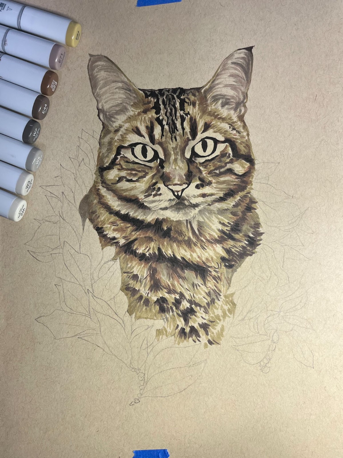
Next I went in with various warm grays and browns to build up his tabby coloring. This brown paper really lends itself well to tabby coloring!

Then I tackled the pinks of his nose and ears, and his green eyes. This portrait is a little more straight forward “cat color”. I recently did a black cat that was a lot of fun because I got to play with more blues and purples.

Once I was happy with the cat in general (we haven’t gotten to the color pencils yet!), I tackled the Maile lei. Being that I do mostly animals, my green selection of markers is limited, so I’m glad that dark blue worked to bring the depth. This is a situation where, when working quickly, you can blend (or at least blur) the inks if you overlay a lighter ink on the darker. Laying down the dark blue, then immediately the lightest green helped take the edge off.

Now here’s the fun part – the white pen and color pencils! I used my bright green pencil to highlight the eyes and sharpen the edges of the leaves, and then the blue-gray pencil to cool down the leaf highlights. The light tan pencil (my favorite, as you can tell by how shaved down it is!) is the perfect warm highlight for animals this color. I brightened up the patches around his eyes, his stripes, and the hairs in his ears. Then the white brush pen added the white to his nose and a couple highlights here and there. The Jelly Roll pen added absolute white highlights (eyes, nose) and his whiskers. The white outline is a style choice I made a while ago and have stuck with it, because I think it makes the whole portrait pop more.
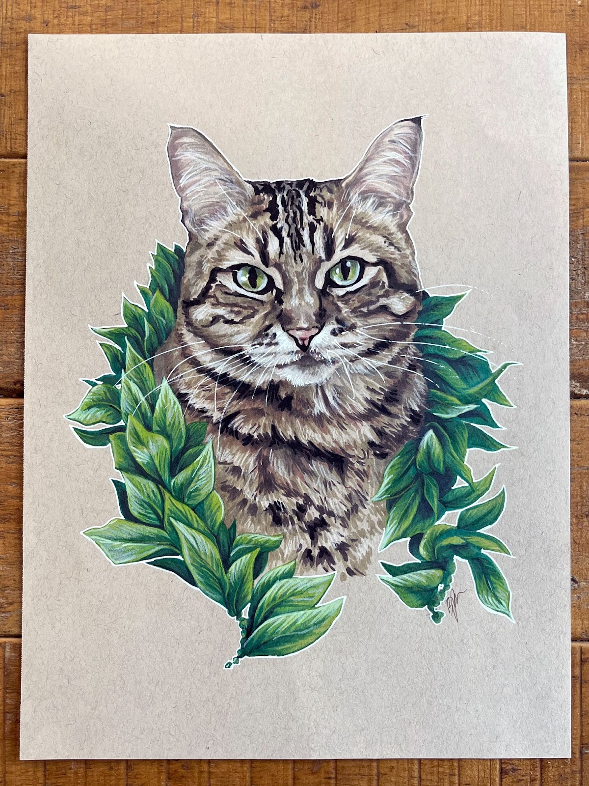
So here he is in his final glory! Thanks for following along, and I hope you learned a technique or two you can take with you in your own work!
I wish I could say that you could commission your own pet portrait, but I’m about to go on maternity leave, so go to Instagram and follow @sit.stay.sketch to get news of when I’m back!