Posted on

Fixatives for Charcoal, Pencil, and Chalk; Is it Worth It?

messy art supplies and papers

A fixative is designed to enable artists to lose the least amount of their work, especially when it is important to conserve as much as possible. Let’s explore more how fixatives for charcoal, pencil, and chalk can help or hurt our art.

Why Would You Use Fixatives for Charcoal, Pencil, and Chalk

Our art is precious to us. It represents our thoughts, emotions, and interests, directly from our hand. Drawings are a great way to create and express ourselves. They also allow us to study objects, develop beautiful scenes, and make wall art that suit us, our friends, or our customers.

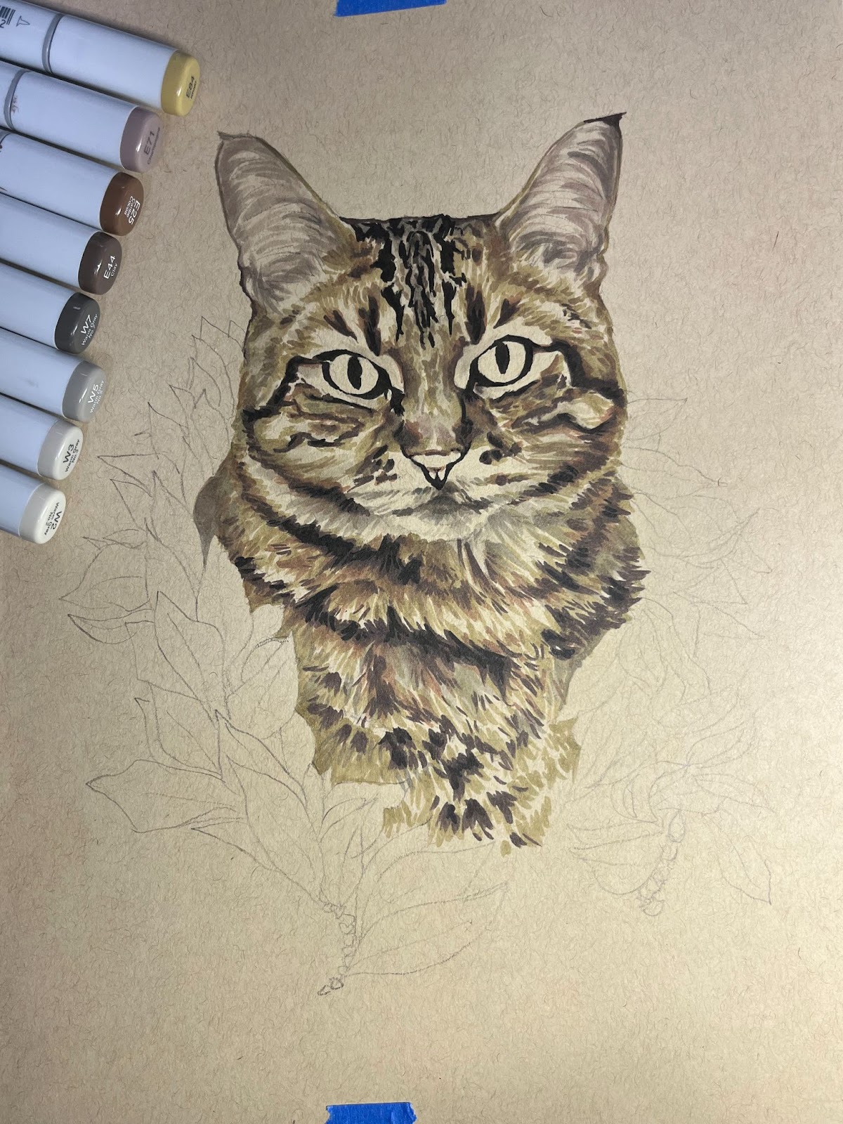
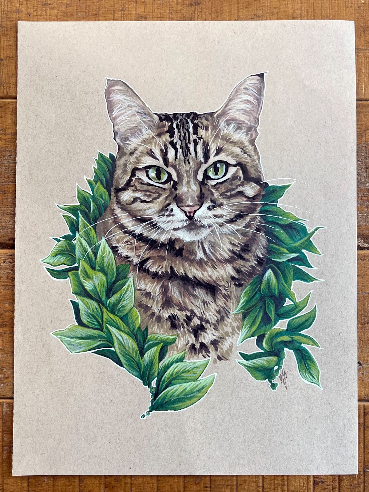
The last thing we want is for our art to be compromised in its quality and ruined by smudging, flaking, or smearing. Chalk and charcoal in particular are very prone to being disrupted, with particles falling at the smallest bump or movement. Even blowing on powdery charcoal can make it fly everywhere.

What is a Fixative, Exactly?

A fixative comes in a spray can that projects a type of varnish which affixes particles together, sort of like a very thin and invisible glue. Fixatives are meant to be as unnoticed as possible, designed for easy use and no hassles. They are not meant to add to artwork, but to be applied as an invisible aid to the artist.

There are two types of fixatives. One is a workable fixative, the other is a final fixative. They each have their own place, but some artists might want to rely only on one.

Workable Fixative

A workable fixative is meant to be used throughout an artist’s process. The fixative itself is applied between layers of drawing. This helps the artist make changes throughout their practice, without disturbing or disrupting the charcoal, pencil, or chalk. The fixative itself can help accept the medium, acting as a sort of invisible ground that holds the particles to itself.

Final Fixative (non-workable)

A final fixative is meant to hold a drawing together at the end, without further work being done on top of it. Some artists just use a workable fixative throughout and ignore a final fixative, as it might feel redundant. A final fixative, however, can bring an overall harmonious quality to the end product, whether the artist wants a satin or matte finish to interact with light in a consistent way.

Which Do You Choose?

This comes down to the preference of the artist and their working methods. By reading how fixatives work you might get a sense of how you could use them. Just be sure to understand that a final fixative will not work well as an in-between layer of protection. It is meant to be final.

Cons of Using Fixatives for Charcoal, Pencil, and Chalk

The most common frustration for artists when it comes to using fixatives for charcoal, pencil, and chalk is a change in coloring of the paper. When you spray the paper with the fixative, it does alter the way the paper looks, even if only slightly. That might be enough to bother some artists.

However, some of this may be due to faulty use. While there will probably be some change in the color that is unavoidable, there are good practices to prevent it from being overwhelming. Make sure to have the artwork at a vertical angle, not on its back. Otherwise, puddling and oversaturation can happen, making the color-changing worse.

Another thing that may affect coloring is holding the can too close when spraying the surface. This results in a heavy spray, without much finesse and control. Make sure to hold the can far enough away to prevent this from happening. Starting with a small amount helps. Testing on scrap paper also gives you more clarity as to the effect the spray will have on the paper.

Alternatives to Fixatives

Even with practice and a good understanding of fixatives, some artists will not like using them. There are some other solutions that can make for successful drawings and displays.

Paper Choice

First, starting with a paper that has a lot of “tooth” can help from the get-go. This won’t prevent all issues, but it can make things easier from the start. Choosing a paper with texture will help the particles of charcoal, graphite, or chalk remain embedded in the fibers of the surface. This helps the drawing stay together when the paper is moved or jossled, but won’t always help with smearing or smudging.

Framing Behind Glass

While putting the artwork behind glass isn’t a perfect fix in its own right, thinking about the distance you can put between the glass and artwork with matboard helps display the art without problems. Choose a thick matboard to frame around the art and make sure to clean the glass before framing, on both sides. Cleaning the glass with cleaner reduces static, which might interact with the drawing.

Hairspray, a No-No

Do not use hairspray to affix a drawing. In the past, this was something artists did if they didn’t have fixative handy. However, it is harmful to the paper and not acid-free. Avoid it.

In Summary

Fixatives for charcoal, pencil, and chalk are a mixed bag. However, with the proper methods you may end up happier using them than foregoing them. This is especially true if you find yourself frustrated by your drawings smudging or smearing or losing delicate powdery parts.

Ultimately, you are going to have to decide what is most important to you. As technology improves, I’m sure there will be better options eventually, but for now we have to decide based on our own preferences.

Charcoal Supplies at Dick Blick

Pencil Supplies at Dick Blick

Chalk Supplies at Dick Blick

Fixative Supplies at Dick Blick

Interested in Learning a Painting Medium? Read This First

Need More Help?

I am always open to taking on private lesson students. I offer one free half-hour to get an idea of what your goals are and how we can get you to them. Then I design a specific lesson plan for you and we go from there. You can hire me for your personal lessons here at SuperProf or here at LessonFace.

Posted on

Charcoal or Pencil: What’s the Better Drawing Tool?

Orcas Island Sailboat Art Print Drawing

Which Medium is Better for Beginners?

Maybe charcoal vs pencil is a debate that seems silly and not worth having. However, I can look back at my past and see ways in which charcoal might have been a better solution to learning how to draw. I grew up on the pencil. We all have pencil experience. But maybe if you haven’t tried charcoal, you should reconsider.

Pencils: The Trusty Sidekick

As a child in the 80’s and 90’s, there were a small handful of ways we could draw and create. Crayons were a big deal at the time. Markers (especially those smelly ones) were pretty cool, too. I suppose we all might have done some finger painting at some point. But it was the pencil (graphite or colored) that stuck with us through the years.

We weren’t learning cursive with crayons, nor were we writing our first essays with markers. No Senior papers were being turned in with finger paint covering them. It was pencil (or sometimes pen) that was our required implement. It makes sense, because pencils are easy to write with. They have a nice point to them that is very handy for clearly writing the small shapes that make up letters and numbers. They are a detail-oriented tool.

How many classes did you attend where you realized you didn’t have a pencil and had to ask a neighbor or, ashamedly, a teacher if you could borrow one? How many tests did you take that required a number 2 pencil? We used pencils so often that I developed a favorite brand and model. The Ticonderoga number 2 pencil was where it was at! Other pencils were poseurs and amateurs with waxy tips that couldn’t replicate the chilly sharpness of the Ticonderoga.

Pencils: The Measure of an Artist?

This attachment to the pencil (and the readiness at which they were available) forced us to also draw with them. Sure, crayons and markers and paint were utilized in the arts and crafts modules, but those could be few and far between. An occasional treat. Think back to high school. When you think of the artsy kids who were creative, how often did you see them associated with their pencil and pen skills? It seems like at least half of the art projects in school revolved around pencils and pens.

Drawing games also revolve around pencils and pens. Pictionary comes loaded with pencils. Telestrations has dry erase markers, which are no less restrictive. Pencils and pens are cheap, clean, and easy to package. They are incredibly versatile, too.

I got really good with a pencil. I stuck with it. Where other kids were not as dexterous with their pencils, I was trying things, experimenting, finding the best ways to progress with them. Hatching, shading, blending, and on and on. For whatever reason (lack of interest, early disappointment, frustration with the tool, some other combination of events), other kids just weren’t really adapting to the pencil as well.

Is There a Better Alternative?

Now, I do believe in some amount of natural abilities, whether by nature or nurture or both. However, I remember my first time using charcoal. It was incredibly difficult for me. I had to completely change the way I thought about drawing. It wasn’t in the dexterity of my fingers anymore, but in the control of my whole arm; not just small details anymore, but large shapes. It wasn’t building from the inside out, but from the outside in.

And that’s exactly how beginners (young and old) should be thinking about drawing. I was oddly blessed to be as apt with a pencil as I was, working through the stages of drawing development quickly with a pencil. Others would be so much more served with charcoal being their first real drawing implement. I would pit it against pencil any day.

Pencil is a great tool. I still draw with pencil and I doubt I will ever stop. But it is NOT the best tool for learning how to draw. That award goes to charcoal. Charcoal is without a doubt, the best medium for beginner drawing. Couple charcoal with good-natured playfulness in art, exploration, a good amount of knowledge and practice, and you’ll find a student that will grow by leaps and bounds in every facet of drawing, including observation, problem solving, and stress relief. So, in a competition between charcoal vs pencil, I come down on the side of charcoal, for beginners.

Nevertheless, I think any implement is better than nothing! And pencils are fantastic in their own right. You’ve got to choose the medium you most want to use.

I truly believe that anybody with an interest can enjoy and excel at drawing. Remove every false and limiting belief, because we’re all on equal ground. You’re not too young or old, too slow, too poor, too busy, or too late to become good at drawing. It isn’t an impossibility, but is actually quite possible.

Why You Might Want to Start Drawing

And here’s what drawing does for you:

  • Communicate visually
  • Increase memory
  • Raise observational skills
  • Boost learning ability
  • Spark your imagination
  • Help you unwind and relieve stress
  • Create avenues for exploration
  • Improve problem solving
  • Lower anxiety
  • Increase emotional intelligence
  • Open you up to other pursuits
  • Grant the ability to create beautiful drawings for loved ones

I will be continuing to communicate my thoughts on drawing over the next few weeks.

Drawing Pencils Available at Dick Blick

Charcoal Supplies at Dick Blick

Are You Interested in Painting? Read this Article on Painting for Beginners

Need More Help?

Speaking of painting for beginners, I am always open to taking on private lesson students. I offer one free half-hour to get an idea of what your goals are and how we can get you to them. Then I design a specific lesson plan for you and we go from there. You can hire me for your personal lessons here at SuperProf or here at LessonFace.

Posted on

Drawing Pet Portraits with Beth Reidmiller aka Sit.Stay.Sketch

pet portraits

Note from Adam: I asked my friend Beth to write up a guide through her process. I’ve known Beth for over a decade now (time flies!) from our days in Grad school at DigiPen. She’s a talented artist and I’ve been consistently impressed by her pet portraits which have such amazing artistry and character to them. I would highly recommend giving her Instagram a follow (@sit.stay.sketch) and visiting her website (Beth Reidmiller). I hope you enjoy this fascinating look at her process. 🙂

Written by Beth Reidmiller

Hello there! My friend and fellow grad-school-survivor Adam asked me to write up a bit about my process, so if you like pets and art….read on!

I have dabbled in a lot of different mediums during my time as an artist. My undergrad degree is in painting where I mostly did acrylic abstract pieces, my graduate degree is in digital art where I 3D modeled characters but also really got into figure drawing. Now I digitally color comics in Photoshop as a day job, and I’ve been taking pet portrait commissions for the last few years mainly in ink and color pencil. All mediums have their perks, their challenges, and their limits. But it doesn’t matter what tool is in your hand, you’re still using the same decision making processes with the basics of color theory, form, contrast, value…ya know, the things your middle-school art teacher probably tried to teach you, but you were busy drawing Sailor Moon.

What I Use

So as I mentioned, I’ve been doing a lot of pet portraits over the last few years. I’m a huge dog lover, so I find a lot of joy in the various pets people entrust me with. And because of this, my physical-media collection has grown quite a bit. Here’s what I use:

Copic Markers: These are alcohol-based art markers, and they are top-shelf. They may seem expensive, but you can replace every single part of them as they wear or run out, so in the long run they are actually quite economical! There are lots of rip-offs, but in my experience, if you’re going to commit to using them, they’re worth the investment. I personally like the “Sketch” series, because I use the brush tip almost exclusively.

The unique thing about these markers is, well, they’re markers. The color is set. Since they’re alcohol-based, you can do some blending (depending on the strength of your paper), and depending on the color, they are relatively transparent. But similar to watercolors, you have to commit to your strokes, and if you go too dark, you’re kind of stuck. This is also where the cost comes in – if you need a specific color, you can’t just mix it, you have to go buy that color. (Although apparently you can mix your own ink colors using the refills, which is pretty cool, but their catalog is so huge I don’t think I’d ever need to do that…)

Tombow Markers: I used to use these a lot more (their greyscale set is killer). I still use the black more often, as it’s a stronger black than the Copic marker. But for a greyscale project, these are really lovely. I love the brush tip, but they do not blend.

Faber Castel White Pens: I. Love. These. Pens. Faber Castel makes a white pen in multiple sizes and nib types. The brush nib is slightly transparent but can be built up. But if you want a really strong white line…

Gelly Roll: You heard me. Gelly Roll size 10 is shockingly, in my opinion, the best white ink pen on the market. (Don’t go any smaller than 8, as the ink is too thick to flow.) I love this pen, and you’ll see below that I use it to great effect.

Color Pencils: I use the same color pencils I was given nearly 20 years ago, as I only use them for accents. I don’t have a single brand I love, but I tend to like softer pencils.

So here is my setup when I’m working on a portrait. Reference photo on the screen, all my supplies in front of me, and the piece I’m working on taped to my LED lightboard. I do the initial sketch digitally, print it out, use the light board to transfer it to the paper with pencil, then go into more details by sight. Due to the nature of the Copics, they will smear pencil, so I rub a kneadable eraser over the finished sketch before I start.

You’ll see in the photo above that I have a color chart for the Copics. This chart is so dang handy for many reasons – first being the plastic caps very rarely show the true color of the ink, and second, it helps me stay organized.

Most pet portraits I do are on toned paper (either brown or gray, depending on the color of the animal). I really like how white ink and light color pencils make the subject pop off the paper, so although I do offer portraits on white paper, the most common is the brown paper. 

Much like starting a painting with an underpainting, starting on brown paper helps me set the mid-tone. When I start on white, I work more like watercolors with the lightest areas first, and build up layers of color. When I’m working on toned paper, it’s a little more like painting with gouache, as I know I can lighten some things up later with white ink or color pencil. I keep a scratch piece of paper next to me so I can test marker colors to make sure they’re what I’m expecting (some of the lighter colors don’t show up at all).

My Process

So for this portrait, Pepeiao, the client requested he wear a lei. A couple years ago I did their two dogs with leis, so they wanted to complete the collection. 

I started with the darker outlines for him, since they’re so obvious and striking, and helped me keep track of the form. I had to make sure the black ink I used wouldn’t blur or smear when interacting with the Copics – always test your materials! Good news: Tombows and Copics can be friends. 

Next I went in with various warm grays and browns to build up his tabby coloring. This brown paper really lends itself well to tabby coloring!

Then I tackled the pinks of his nose and ears, and his green eyes. This portrait is a little more straight forward “cat color”. I recently did a black cat that was a lot of fun because I got to play with more blues and purples.

Once I was happy with the cat in general (we haven’t gotten to the color pencils yet!), I tackled the Maile lei. Being that I do mostly animals, my green selection of markers is limited, so I’m glad that dark blue worked to bring the depth. This is a situation where, when working quickly, you can blend (or at least blur) the inks if you overlay a lighter ink on the darker. Laying down the dark blue, then immediately the lightest green helped take the edge off.

Now here’s the fun part – the white pen and color pencils! I used my bright green pencil to highlight the eyes and sharpen the edges of the leaves, and then the blue-gray pencil to cool down the leaf highlights. The light tan pencil (my favorite, as you can tell by how shaved down it is!) is the perfect warm highlight for animals this color. I brightened up the patches around his eyes, his stripes, and the hairs in his ears. Then the white brush pen added the white to his nose and a couple highlights here and there. The Jelly Roll pen added absolute white highlights (eyes, nose) and his whiskers. The white outline is a style choice I made a while ago and have stuck with it, because I think it makes the whole portrait pop more.

So here he is in his final glory! Thanks for following along, and I hope you learned a technique or two you can take with you in your own work!

I wish I could say that you could commission your own pet portrait, but I’m about to go on maternity leave, so go to Instagram and follow @sit.stay.sketch to get news of when I’m back!

Posted on

Making Your Own Art Show

colorful arts hanging on wall

Opportunity Knocks

So, you’ve got an art show coming up and you want to make sure it’s a fun and professional experience for all visitors. Maybe you’re hoping your art will make enough of an impression for some sales. Or you just want your work to be experienced to the truest degree. I’m going to walk you through the basics of getting that show ready for the public.

Making Your Selections

assorted paintings
Photo by Medhat Ayad on Pexels.com

The first thing to figure out is what you are going to be showing. Wouldn’t be much of an art show without a selection of art to display. This process can rely on what kind of art you create and how much you’ve accomplished over recent years. Perhaps you have a series of works that are meant to go together – making this process a little easier. However, you might be doing more of a retrospective or a hodge podge of work that represents things you’ve made over the last decade or more. Or maybe you have enough recent work to fill a library, so you have to whittle down your options a little bit.

First thing, know what the goal is. If a curator is asking for specific examples of work that you have, then it won’t be as free-form as putting together an array of your work. Once you know your goal, the selections become easier. If your goal is to display lots of small intimate work, then it wouldn’t make too much sense to have large bombastic pieces everywhere. What’s the feel of your show? What do you want your viewers to leave reflecting on?

If you have a wide assortment of pieces that you just can’t decide between, it’s time to exercise those creative juices and decide upon a theme. Much like an artist might do when it comes to developing an idea from thumbnails to finish, you could break out the sketchbook and start jotting down ideas or sketching out thematic options. You will have to trust your gut when it comes to the harder choices. Remember, your work will be up for the public and you want it to be a reflection of all the things you love!

Putting Together the List

person holding blue ballpoint pen writing in notebook
Photo by picjumbo.com on Pexels.com

Once you have your selections, start putting it down in a list. This is going to help you wrap your head around what you’re showing. It will also give you the opportunity to title things that are not yet titled. Along with titles, you will want to put together whatever pertinent information there is for each piece, such as the dimensions, the year it was made, and the medium. If there are pieces that are on loan from any private collectors or institutions, you’ll want to indicate that by saying something like, “Courtesy of the Gallagher Family” or “Private Collection.”

This list is going to help you make sure everything has a name and set amount of information. It will build your confidence that you have what you need for the show. And it’s just a great way to compartmentalize and condense what might be an overwhelming amount of visual and mental information. Don’t put this off to the last minute because sometimes specifics can be hard to find or remember, such as dates and dimensions. This can also be a great time to start thinking about prices and placing them on the list, too.

Name it! And Write About it!

crop artist with painted spectrum in notebook
Photo by John Diez on Pexels.com

Name that show. What is going to summarize the work? This is up to you. My tendency is to keep the name simple. My most recent show was called “Discoveries.” This felt like a nice summation of the paintings I had on display and the logic behind my work. You can name it whatever you want, though, and in your own style. Perhaps you like more information or more vagaries. This is a creative element and you should own it.

Then you should write about it. Have an artist’s statement. I’ve read many a statement and there are so many that feel overwrought, overly impressive, hard to read or understand, etc. My advice would be “keep it straightforward.” Write down the most important elements. Then read through what you’ve written and rewrite it. I would aim to read and rewrite a good handful of times. You want to tighten everything up and present the ideas as clearly, yet artistically, as possible. Most artist statements I’ve seen end up being 3-4 paragraphs on one page. You want something that won’t take up everybody’s time. You may want this artist statement printed out on a number of takeaway papers or postcards, so that people can grab one and read it on the go, rather than standing in one place, reading from the wall.

Odds and Ends

black claw hammer on brown wooden plank
Photo by Pixabay on Pexels.com

Do your works need frames? Do they need hanging wire? Do you have time to sign any of them, if they are not signed? Getting some of the missing stuff together can really help make your show feel much more professional. I recommend frames, as I think they really add to the whole experience for the viewer. Even if you go with simple framing, your paintings will benefit from that extra amount of attention and impression.

Get the hardware needed to hang. I prefer actual hanging nails that have the peg framework. These are much sturdier than just a nail in the wall. These are also known as drywall hanging nails or picture hanging nails. Using hanging wire will also help with the hanging process. The packaging usually has a nice diagram for how to attach the wire to the frame in a way that creates a nice sturdy knot.

Hanging the Work

people looking at the paintings in hallway
Photo by BERK OZDEMIR on Pexels.com

There are many ways to hang your work. The first thing you should do, though, is place your work where you want it around the space, without hanging anything yet. Having everything arranged will help you visualize how you want the work displayed, as far as sequencing goes. Which paintings will look best next to each other?

Now it is time to decide what height you want your pieces to be. I would recommend that whatever choice you make, you continue with it throughout the show, as a formula. I prefer hanging all of the paintings along an imaginary straight line through the middle of each piece. This allows for comfortable viewing angles. I like to have the middle of the pieces sitting about 5 1/2 feet off the ground. This is an average height, so it’s comfortable for most.

The way to hang this properly is fairly simple. You need to decide upon an average height for the center (such as the aforementioned 5 1/2 feet or 66 inches). Then measure from the middle of the canvas to the point at which the nail will be pulling the hanging wire taught. Find the distance there are add it to the average height. For instance, if the distance between the center of my painting and where the nail will pull the wire taught is 10 inches, I would add it to the 66 inches. I would then put the hanging nail in the wall at 76 inches. The painting would then be placed and should hang in such a way that the middle of the painting will hit that 66 inch mark. If you are not using wire, but brackets, measure vertically from the midpoint of the painting to the brackets and make that your extra distance.

Always have a level with you to ensure the painting will hang correctly and look even on the wall. Make sure that each piece has enough space between itself and the ones next to it. Stand back from the wall for this. Imagine you are a member of the public. What distance feels correct and comfortable for viewing? Are the pieces too crowded? Would I be standing right against somebody viewing a different piece?

Information!

stacks of printed leaflets with an elegant font in a studio
Photo by Mathilde Langevin on Pexels.com

Having the information next to the piece is not as hard as it may sound. There are many ways to do this. A traditional way is to print out individual information on separate thick pieces of cardboard or foamboard. This can be difficult to do without the right printer, so I suggest printing on sticker paper and then either adhering it to thicker paper or applying it straight to the wall. Find a spot near the relevant piece and place it where it feels most correct. Remember, try to stay consistent throughout the entire space and with each individual piece.

Have a blurb about yourself, either on a stand or on the wall. Have some things that people can take with them, such as postcards or business cards. You can even have a price sheet, if you are interested in selling your work. If you have a reception, you can set aside a space for selling prints or other merchandise. You will most likely want somebody other than yourself to man the sales area, as you want to be present to talk about your work and chat with guests.

Ready?

photo of woman painting while smiling and standing by the table
Photo by Andrea Piacquadio on Pexels.com

This little guide should be enough to get you going in the right direction or give you some options to think about. Remember that you may have to stay flexible and creative with how you display your show. Ultimately, you’re putting up some of your work for others to look at and enjoy. What is going to make that a memorable, interesting, or fun experience for them?

Take some time to enjoy the moment and relax. Congratulations on your art show!

Posted on

“Created to Create” an Interview with Jonathan Shaw (Yehonatan-art.com)

The Heart of the ArtistOne of the friends I’ve met on my art journey is an artist whose work is both instantly recognizable and endearing. Working with textures, colors, shapes, line, and smart design, Jonathan Shaw demonstrates a careful and loving approach to his artwork. Paintings are imbued with his unique vision, delving fearlessly into matters of faith, biblical history, and the person of Christ. These subjects are not new to art, having a rich history through the commissions of the church. However, in our modern world it takes a good amount of courage to embrace so fully the subject of religion, especially with the earnestness that Jonathan displays.

Besides the realm of glory, Jonathan’s art goes into wonderfully realized areas of whimsical design, with charming compositions and playful shapes and colors. His is an art that embraces imagination and creativity, being both conceptual and representative. It is always very clear that he has fun with his work, developing a visual language that easily and cheerfully communicates that fun to his audience. All of this is to say that I dig it. That’s probably clear by now.

Soft-spoken and friendly, Jonathan gives off a spark of lively spirit, being quick to smile and engage. His demeanor is often indicating his readiness to listen and enjoy others’ personalities. I was excited to learn a bit more about his process and history with his art.

Adam Kenney: Please introduce yourself.

Jonathan Shaw: My name is Jonathan Shaw and I am a freelance artist. My family had roots in the Colorado Rockies near Aspen but I was predominately raised in the Milwaukee area where I now reside with my wife, Kelsey, and our two young boys. I received my BA in Studio Art with a minor in Art History from Seattle Pacific University in 2010. I enjoy time spent with my wonderful family, mountain biking, grooving to good music, swimming in the beautiful Lake Michigan, being in the great outdoors, exploring the city, gathering with friends, and chatting about scripture. 

AK: What are your primary ways of making art?

JS: I am a multidisciplinary artist who works with paint, collage, illustration and a wee bit of design work. The majority of my subject matter involves Biblical narratives and Judeo-Christian themes portrayed playfully with paint and other media. 

When I was growing up, my father often traveled to a variety of foreign countries as a documentary filmmaker. I distinctly remember the time he returned from India with intricate woven rugs and blankets, carved wood jewelry boxes, and tiny painted stone animals. I was drawn to the beauty of the patterns, the aromas, and the exotic aesthetic. Experiences like this one from childhood have significantly influenced my stylized approach. Much of my work could be defined as whimsical folk art. I love incorporating patterns and symbols that poetically imbue the artwork with a meaningful message.

AK: How long have you been working with art?

JS: It’s certainly been a good long journey. I’ve been drawing ever since I can remember. My mum jokes that I drew before I spoke. I actually took speech classes with a tutor in Kindergarten and 1st grade because of my delayed verbal communication. I have always been a very meditative and visual processor which has definitely served me well as an artist. Throughout my elementary years, I faithfully drew with colored pencils in a couple of sketchbooks and as the years went on I got a taste for other media such as printmaking, collage, ceramics, jewelry, sculpture, and painting.

Shortly after graduating college in Seattle in 2010, I moved back home to my family’s farm in Wisconsin and focused my time on my art practice. Honestly there wasn’t much to do other than farm work, exploring our 160 acres of fields and forests and creating artwork. Although this season only lasted a year before jumping back into the “work force,” the time has been foundational to both my faith and my creativity. 

As a freelance artist, I’ve had the privilege to make my own personal body of work along with a variety of commissions from clients which has included published book illustrations, large scale murals, logo designs, websites, portraits, and collaborative projects. In summation, I’ve been selling artwork and have taken on commissions since 2010 while holding other jobs, but it wasn’t until the beginning of 2021 that I’ve done it full time.

AK: Why did you decide to make art a focus of your life?

JS: I hold a strong conviction that I was created to create. Nothing else grounds me in the present and helps me process life quite like creating art does; it’s very therapeutic for me. So after several years, I finally was able to become a full-time freelance artist. I know that if I looked back on my life and hadn’t used my creative gift to its fullest potential, I would really regret it. So here I am, pursuing my passion one step at a time.

AK: In what ways have you been changed by art?

JS: Art has taught me many valuable lessons and cultivated several beneficial practices in my life. Creating art has taught me patience, critical thinking, how to listen and observe well, and that life is a continual work in progress. Art has also allowed me to learn more about my subject matter whether that be nature, culture, or aspects of scripture.

AK: What is your primary focus when creating art?

JS: My primary focus when creating art involves a process of discovery. I tend to focus a lot on learning more about my subject matter; investigating and meditating on it. Similar to the adrenaline rush that comes from a good descent on the ski slope, creating art has an exhilarating effect for me; both in the discovery aspect and the mystery behind it. This dynamic keeps me coming back for more.

AK: What artists do you look up to or find inspiration in?

JS: I often resonate with the work of several 19th & 20th century painters such as Marc Chagall, Henri Matisse, Pablo Picasso, Vincent van Gogh, and Paul Cezanne, as well as self-taught folk artists. My favorite among this group is Marc Chagall. I’m fascinated by his whimsical and colorful depictions of Biblical narratives, childhood memories, Jewish practices, and dream-like scenes. I find his work to be so poetic, imaginative and graceful.

AK: How do you stay motivated?

JS: Over the years I’ve come to learn that creating art requires balance and that art is not the end-all-be-all. I’ve discovered that when I am flourishing socially, mentally, physically, and spiritually; creativity flows more effortlessly. Just as important as a well-rounded life, restoking the creative fire through being immersed in others’ artwork is very significant for my motivation as an artist.

Likewise, morning bike rides in the warm months have been very beneficial for me. It allows me to loosen my grip on the day and release any fears that I may be harboring. Reading books on creativity is also very helpful. I’m currently working my way through “Real Artists Don’t Starve” by Jeff Goins. Throughout the year I read Julia Cameron’s daily artist devotional called “The Artist’s Way.” I highly recommend both of those reads. 

A big motivation for me lately is being involved at a local gallery where I exhibit my work. It’s been so encouraging to meet other artists and to spur each other on. I am preparing for a solo-exhibition later this year which also keeps me excited and motivated. It’s encouraging to know that my artwork has and will touch people’s lives and that keeps me going.

AK: Do you have any regular rituals that help you keep your focus?

JS: A few things come to mind. Music has always played a significant role in my creative process. I find that tunes help me gain momentum and usher me into a good rhythm. Living a simple, down to earth lifestyle and being “close to the land.” This may look like taking walks with my family, tending to our garden or kayaking down the river.  Every once in a while I find it helpful to look at other artists’ work; both contemporary and from the past. This endeavor provides several benefits from feeling a part of a larger community to discovering “resonating voices” that harmonize with my own work. One of my favorite ways to do this is by going to Barnes & Noble and paging through art magazines or better yet, going to a local used-book store and finding old books of artists I like. 

AK: In the last year what has made the largest impact on your practice?

JS: I’d say the decision to resign as a mail carrier from the Post Office and taking steps to cultivate my art career full time. Leaving behind my postal job was a big leap of faith for me but it really allowed me to take myself and my artistic calling seriously.

Community has also played an important role for me in this season. Specifically joining an online art mentor group has done wonders; learning new skills, ways of thinking, and professional advice. Along with this online community, being involved at a local gallery and studio has made a large impact (and I mean local; the space is only three blocks north of us). It has been so encouraging to exhibit my work there and to speak with others at its open receptions. I am also currently taking steps to be an artist-in-residence at this studio gallery.  

AK: Do you think there is something missing in the “art world”?

JS: Great question. I honestly haven’t thought much on this subject so my thoughts may be a tad undeveloped but I’d say maybe opportunities for up-and-coming artists to find outlets for their young careers to take flight. This could look like galleries exclusively tailored towards emerging artists, more opportunities to learn from veteran professional artists, and various apprenticeships. 

AK: What would you like to see more artists do?

JS: Pursuing a creative career can definitely be difficult especially when doing it alone. I’d love to see more artists coming together to encourage and inspire one another. I’m casting a vision in my local area to gather artists to view and discuss works in progress and exhibit artwork together. 

AK: Any last keys to your art practice?

JS: I would say, having a renewed mind in Christ is one of the biggest keys for me. This allows me to create out of a place of affirmation, anchoring me in the Father’s love even when discouragement and disappointments come. One way that I remind myself of this is signing my work with the Hebrew translation of my name, Yehonatan, meaning “Yahweh has given.” I consider the ability to create a wonderful gift as well as a collaborative process with my Maker. My hope is that my artwork blesses and inspires others. 

AK: Where can people find you?

JS: Folks can find me on my website www.yehonatan-art.com

on my Facebook page www.facebook.com/yehonatan.art

or on my Instagram www.instagram.com/yehonatan.art

1. “The Heart of the Artist”
Watercolor, gouache, crayon, colored pencil on paper, 11×14” – 2021

2. “The Alabaster Jar (Tears, Hair, Kisses, Oil)”
Graphite, ink, colored pencil on paper, 9×12” -2021

3. “Open Table”
Acrylic paint on canvas, 30×40” – 2020