
A Short Hike Brings a Beautifully Simple View
Psst. Hey. All you workaholic artists out there, let me tell you about a time I had some easy artistic inspiration without burning myself out…
When was the last time you took a break from bending over your easel and decided to go outside? Believe it or not, there’s more to life than putting paint to canvas or pencil to paper and maybe it will just get you excited to share it -visually! – with the world.
A good friend invited me on his birthday trip to Suncadia, Washington a couple of years ago. We golfed (poorly) in the sun, played some fun games, and had all sorts of great conversations. Not only that, but we went down this enormous outdoor staircase that led us to a running stream where we spent too much time skipping rocks and challenging each other’s throwing accuracy.
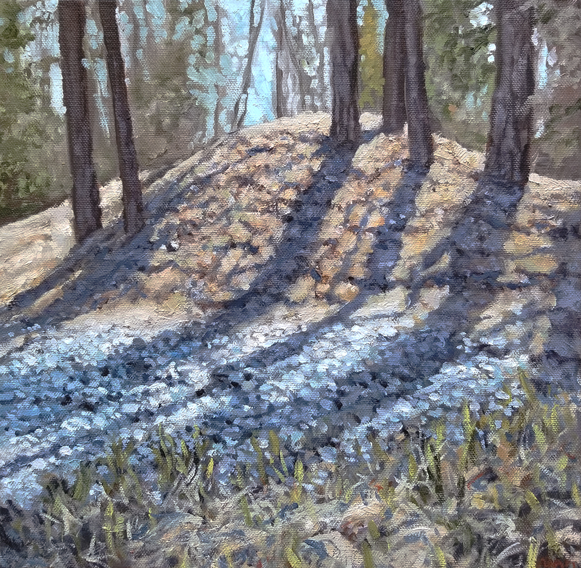
On our way back up the hill, I saw a beautifully simple little sight. Sunlight was filtering through the branches of a small crop of trees sitting on a tiny hill. Something about it hit me in a way that I wasn’t expecting. It spoke of lazy outdoor days, enjoying the sun’s warmth when there’s still a little chill in the air. Being without paint and unprepared to set up for a painting, I snapped a quick picture for use later. Being that I had some artistic inspiration, I was determined to paint this piece.

Laying Down the Right Foundation
When I arrived home I decided to set to work on the painting. I selected a small canvas (10×10 inches) that would serve to display the setting with enough detail and impact, though not overwhelm the viewer in its size. I really felt the small canvas would help to serve the simple nature of the scene, not overcomplicating things with massive presence. I also just wanted to work small.
I had been working a lot with limited palettes at the time of this painting. A limited palette is an approach to painting that encourages the artist to choose as few paints as necessary for the project. Color is very relative and this creates a framework for the artist to work simply. I chose Yellow Ochre, Burnt Sienna, and Phthalo Blue, along with a White (can’t remember if it is Titanium or Zinc) and Raw Umber. This allowed me to get a good range of colors without getting overwhelmed by a huge selection of paint options. I often use Winsor & Newton oil paint (they have a wide range of qualities that can fit any person’s budget).
Getting at it quickly was pretty important for me. I wanted to really make sure that the painting had a good amount of life to it and I truly believe that the more free a painter’s strokes are, the easier it becomes to imbue visual interest. The way we use our paintbrushes can absolutely communicate how we are feeling, in subconscious ways that even unaware viewers can perceive. It’s like talking on the phone in a good mood versus a bad mood. It can be heard in the voice, despite any of the word choice.
Using a stiff brush allowed me to get some nice textured and lively strokes on the canvas. Having that right amount of tension from the hand to the brush to the spring of the canvas imbues the painting with a personality that may not come through in just the colors and composition. I ended up being very happy with the way the preliminary layers were coming together.
Overall, I wanted to make sure that my enjoyment of the outdoors on that trip to Suncadia would come through in the painting. I always seem to work more enthusiastically when I experience the artistic inspiration that quiet and peaceful moments can provide – it would be very satisfying to communicate and share that expression with others.

Things that Did Not Work
Despite all of the early artistic successes with the piece, I didn’t know when to stop. That’s a huge learning curve for painters. Maybe it’s weird to hear an artist question their judgment on their own blog that’s part of their website where they run their business. I think it’s more important to be honest about how I was feeling regarding my work. I just didn’t know how to maintain the freshness of the painting, as I added more detail and more layers of paint.
Let this be a lesson to you! And me. I don’t think my painting is bad, by any means, but I do wonder if it could have been better if I had left it alone or been more selective with my “improvements”.
The colors were also a learning experience for me. While I am fond of the painting, I do think that some of the colors were really challenging. The thing about direct sunlight is that it can reflect off of surfaces, such as grass, and become very bright. However, in doing so, it loses a lot of the intensity of color that we hope to find in paintings. So, there’s a choice that the artist has to make, which is between adherence to realism and adherence to visual interest. I’m not sure there is a right answer, but I do wonder if I chose the correct path.
One technical thing that can add to the difficulty in painting with enough color intensity is the photo reference. Great photos are the result of a good photographer and a great edit. Cameras don’t work exactly like our eyes do, so there can often be a big difference between the way we see something in person and the way it comes to us through a photo capture. Contrast, brightness, intensity, and even perspective can be altered in a way that is just not as satisfying as what we are seeing in person.
If you are experiencing any issues like these that are getting in the way of communicating your artistic inspiration, I would recommend trying to find ways to introduce saturated and intense colors. Just try it in a few places and you might find yourself thinking entirely different about your painting. You may even be encouraged to increase the vibrancy of all your colors.
The Big Finale
The artistic inspiration came to fruition, eventually, when I put down my paint and brushes and called it. Happily, I walked away from the painting feeling like I had accomplished something decent and learned a lot along the way. That really is what I hope for most when I paint, that I will learn something. And most times, I do.
So, I added texture, color, balance, harmony, and eventually my stamp of approval. I do not think it is my greatest painting, by any means, but I do look at it occasionally and find myself studying aspects of it, with a grateful heart and a happy smile.
Here is a short series of three phases of the process. You can see how I started, began to adjust my colors, and then did some final adjustments to bring some more interest back in. Scroll back to the reference to see the changes I made, the things I de-emphasized, and the creative choices I made in a journey to simplify and economize my colors. You might also notice how my limited palette did in replicating the original colors.

While the first image in the process has a nice earthy quality to it and a good balance in the values, I do recognize the polish of the final image and how it conveys the textures and features with more crispness. I think I could balance my strokes a bit more, in hopes to keep that casual feel that is happening in the first image. I also could stand to control my use of white a bit.
So, there’s another Art Story from me, giving you a little background on one of my paintings. I’ve always enjoyed getting some behind the scenes looks at how people work and what they think of what they’ve created (warts and all). I hope you enjoyed this post and will find yourself in the midst of artistic inspiration sometimes soon.
You can find a print of this painting here.

You can also read my Art Story about my Haystack Rock painting here.