Posted on 2 Comments

3 Strong Strategies for Mixing Colors

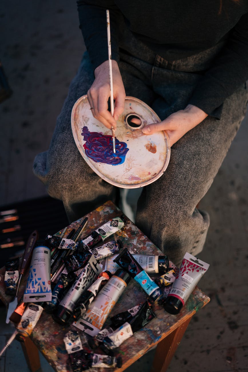
a painter mixing paint on palette using a paintbrush

Keeping it Simple and Easy

Mixing colors is something that every artist has to do at some point. As an oil painter, I find it to be one of the most important elements that has to be done right to get good results with my artwork. There was a time when I was oblivious to it, then a time when I realized the significance and challenge of it. Now, I mix my colors with much more confidence, and you can, too.

I have 3 easy and strong strategies that will help you get the best results from your color mixing, whether you mix your paint before or during your painting practice. These are the most basic and effective strategies for mixing colors, so don’t be surprised if you think it sounds too simple.

You will not have to learn complicated color theory concepts. While those can be incredibly helpful in the long run, I want to help you get the most bang for your buck in the shortest amount of time. You can implement these strategies with any form of art that uses color pigment, whether it is acrylic, oil, watercolor, gouache, or any other medium that will allow for the tiny pigment particles to mingle and party together.

A quick note regarding these strategies: they can work simultaneously. However, I have divided them out into a process that prioritizes the most important elements of color. With enough practice, it won’t be long until you’re using these strategies in unison when mixing colors.

We will start by establishing the 3 central concepts that make up color. It is important to give these some good attention, because understanding them will be integral to mixing colors with confidence. Each section has tips that will expound on the simple concepts with illustrations to help guide your learning. At the end of this article, I give you a basic application of these 3 central concepts.

Let’s dive in!

Know the Value of Value

close up of a blue paint mixed on a wooden palette
Photo by ROMAN ODINTSOV on Pexels.com

In art, “value” is the word that describes the lightness or darkness of a color. If I were painting a still life, the shadows would be considered darker values than the highlights, which would be lighter values. Everything we see around us can be defined by their values and there are a wide range of values that our eyes can differentiate between and identify.

Values help us recognize forms and differences between objects through “value contrast”. When one value sits next to another value, the differences are often very clear, especially if the values are widely different. Our eyes are incredibly attuned to recognizing values and the forms that they imply, as it is the main task of our rods and a secondary task of our cones to perceive those shifts in value.

Simply put, light shines into our environment, our eyes see the variations in illumination, and our brains recognize the objects around us, mostly so that we can navigate and understand our surroundings.

When we paint, it is vitally important that we first recognize the values of the subject we are painting. Many oil painters start with the darkest values and work towards the lightest over time. This technique can be very helpful for keeping our values straight and understood correctly. If we are true to the value relationships of our subject, it will become very clear what we are trying to represent. Remember, it’s those values that communicate the forms of the objects we are painting and we are trained to recognize objects through those forms. Therefore, realism relies upon those values.

Think about black and white photography. Even without any hue or color intensity, we can still understand what we are seeing. That is all thanks to value and the forms that are described by the shifts and contrasts between values.

To apply this to your painting process, you will want to practice seeing and recognizing how light or dark the color you are trying to replicate or create should be. If you are a representational painter, pay close attention to those values first, then move your mind towards the next two strategies as you are mixing colors. If you are an abstract painter and mixing colors, think about the contrasts that you will create through value.

Identify the Hue

smudges of paint on a black surface
Photo by Susan Wilkinson on Pexels.com

Once the value of a color is observed, we can jump into recognizing the “hue”. Hue is just a fancy word for the basic color we are seeing. So, yellow is instantly recognized as a “yellow hue”, different from red, orange, blue, green, etc., based solely on its position in the color wheel and its essential family of hues. This is best expressed visually. Let’s look at the color wheel below.

mixing colors

Notice how it is divided up, with each section labeled. Those labels are the “hues”. They are defined as the family of colors that sit within a section of the color wheel or color spectrum. These labels are usually what we think of when we consider and talk about colors. I might say, “This is red and that is yellow.” You would understand what I mean without many, if any, questions.

When you are mixing colors, you will need to identify the hue that is most recognizable. A color that has no neutrality (“grayness”, “brownness”, or “muddiness”) is known to be a “pure” hue. When a color is very pure, the hue is far easier to identify. You still need to be careful and consider if the hue is between two hues or leaning in a certain direction. For instance, a red that you observe might lean towards red-orange or might lean towards red-violet. Knowing what the hue is doing will help you recognize the color of paint you should start with or what colors you should try mixing together.

Establishing a knowledge of the color wheel is indispensable. Break it down into sections. There are 3 “primary” hues: red (R), yellow (Y), and blue (B). These create the “secondary” hues: orange (R+Y), green (Y+B), and violet (R+B). “Tertiary” hues are those that reside between primaries and secondaries on the color wheel. These are yellow-orange, red-orange, red-violet, blue-violet, blue-green, and yellow-green. The 12 hues make up the basic color wheel that artists and designers often use to plan their color schemes and understand the working relationships between hues.

Once you understand hues, you will have a better time choosing what paint to use when mixing colors. For instance, if you want to mix a red-violet using a red paint and a blue paint, you will be better off starting with a more violet red (such as Quinacridone Red or Alizarin Crimson) and a more violet blue (such as Ultramarine Blue). If you were to mix an orangey red with a greenish blue your results would not gain you a vibrantly pure red-violet, but something more brown.

The above graphic shows popular and common pigments placed where they would belong on the traditional color wheel. This can help inform your decisions when selecting paints for mixing colors. Know that when you are mixing colors from pure pigments, you can guess what the results may look like by drawing a straight line between them on this graphic. The middle point on the line will be the average of the resulting mixture.

Knowing your hues makes it a lot easier for mixing colors. It also helps you communicate about color and even spot differences between similar colors, especially those that are “gray” or “brown”. A gray can be “reddish” or “blueish” or “greenish”, etc. Same with a brown or other neutral color. This will bring us into the next section.

Mixing Colors with Intensity

Vibrant red and yellow tulips

Colors cannot be defined only by value and hue. There is an element that speaks to the vibrancy, intensity, or chroma of a color. Intensity relates to that “pure” notion I discussed earlier. A color that is high in intensity will be very vibrant and close to its pure hue. We see that in the flowers shown above, as they radiate pure hues of red, red-orange, and yellow.

Many colors we see do not fall within easily-defined hues. They are lower in intensity and, therefore, harder to associate to a pure hue that they are derived from. These kinds of colors can be known as neutral or muted colors. What do we do with those?

When confronted with a neutral color, it is important to identify what hue the color is closest to. Then we can create a plan for mixing colors. For example, if a neutral color is reddish (often described as “warm”), we want to start there, then introduce paint colors that will bring our mixture closer to the observed color.

Composition in bright colors with gray
Muted neutral colors

There are many ways to neutralize a hue, but different approaches get different results.

If you want the neutral color to retain some of its intensity (not becoming too faded, but remaining strong in color), you need to introduce its “complement”. The complement of a hue is the hue on the opposite side of the color wheel.

As an example, red would be neutralized by green. Introducing just a little green will result in a reddish-brown. The green can either be one distinctly green pigment or the combination of pigments, such as yellows and blues. The less green we introduce, the more red our brown will be, and the more we introduce, the more green it will be. We can also try to introduce more blue or yellow, depending on if we need to pull or push the color in a different direction.

Mixing colors can feel very confusing at first! I know a lot of students that I have taught who really struggled initially to understand how to achieve certain colors with their paint. It really just takes some practice.

Faded or muted neutrals can also be mixed by introducing white, black, or gray. White lightens your hue, known as “tinting”. Black darkens the hue, known as “shading”. Gray desaturates your hue, known as “toning”. All three will lower the intensity of your colors, making them less vibrant. One of the most common painting errors is to introduce white as a brightener. However, while white does lighten, it doesn’t brighten (in the sense of increasing vibrancy).

Applying These Strategies

Paint on wall

Now we understand the three basic characteristics of color: value, hue, and intensity. Every color is going to have some element of each characteristic.

How do we use this knowledge for mixing colors? I have a little rundown of how you might approach mixing colors to match your reference.

First, note the value. Is the color dark? Is it light? Somewhere in between?

Then, note the hue. Can you recognize any? Where does it lean? Compare it to surrounding hues.

Lastly, note the intensity. Would adding white, black, or gray result in the color? Or do you need to keep things more vibrant by mixing together complementary colors?

Soon, you will be making these judgments without even thinking too much. Your color recognition and knowledge of your pigments will increase, you will grow in confidence, and your instincts will gain a more solid and sophisticated foundation. Mixing colors will become completely natural.

Finally, I would recommend that you start painting with a limited palette, if only to understand how colors can interact. A limited palette is a simple selection of colors, usually a red, yellow, and a blue, along with white. Try different combinations (Pyrrole Red, Lemon Yellow, Ultramarine Blue; then Alizarin Crimson, Yellow Ochre, Phthalo Blue, etc.). Try switching out a pure primary with a neutral color (for instance, use red, yellow, and Payne’s gray instead of blue). You will start to learn, firsthand, how these colors interact and the color wheel will become alive in your mind.

Read more great color advice with James Gurney’s book “Color and Light”, found here.

If you’re interested in oil painting, read my invitation and encouragement to you here.

Posted on

Artistic Inspiration from Gorgeous Suncadia, Washington

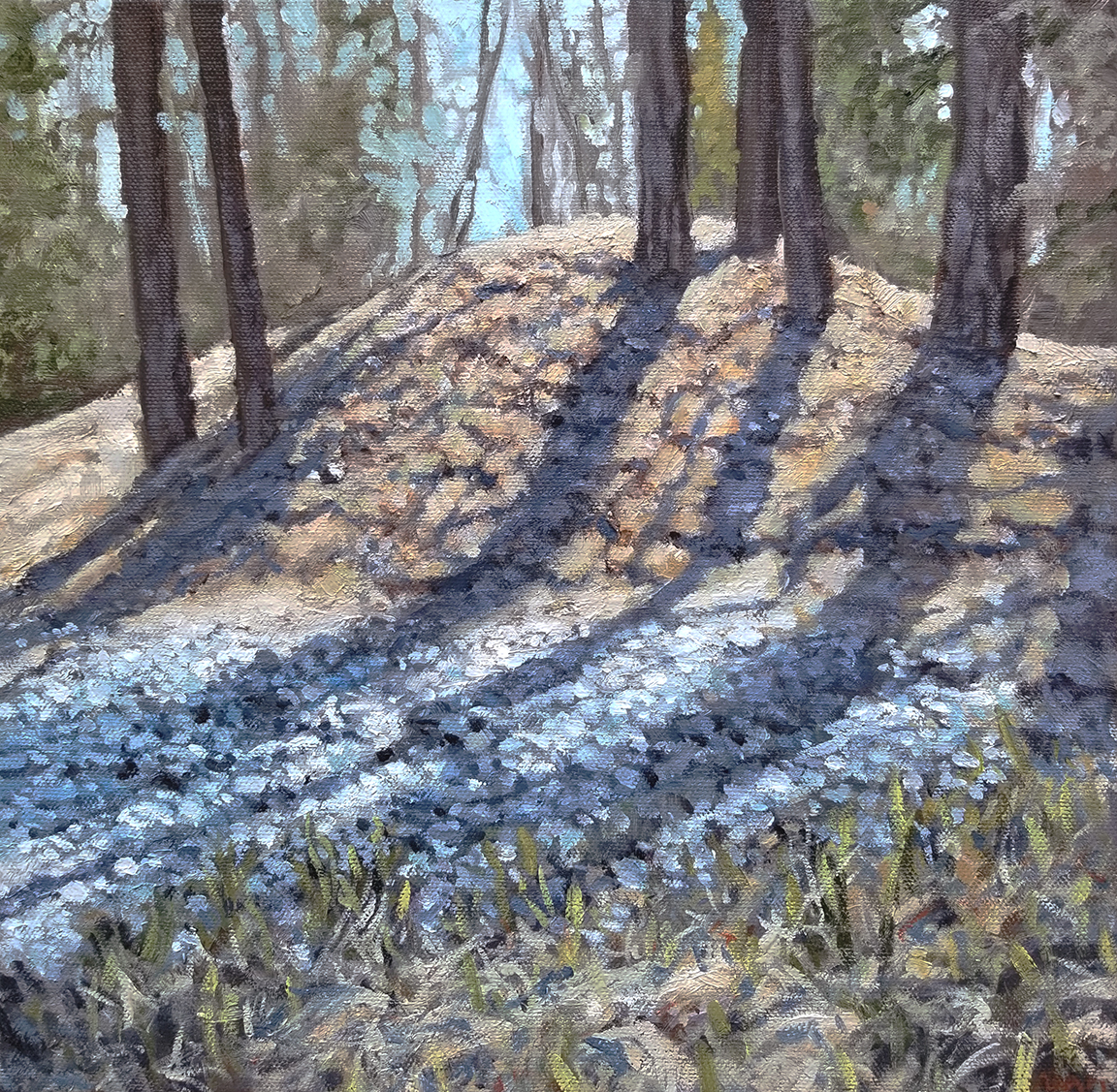
Trees on a Hill Oil Painting

A Short Hike Brings a Beautifully Simple View

Psst. Hey. All you workaholic artists out there, let me tell you about a time I had some easy artistic inspiration without burning myself out…

When was the last time you took a break from bending over your easel and decided to go outside? Believe it or not, there’s more to life than putting paint to canvas or pencil to paper and maybe it will just get you excited to share it -visually! – with the world.

A good friend invited me on his birthday trip to Suncadia, Washington a couple of years ago. We golfed (poorly) in the sun, played some fun games, and had all sorts of great conversations. Not only that, but we went down this enormous outdoor staircase that led us to a running stream where we spent too much time skipping rocks and challenging each other’s throwing accuracy.

On our way back up the hill, I saw a beautifully simple little sight. Sunlight was filtering through the branches of a small crop of trees sitting on a tiny hill. Something about it hit me in a way that I wasn’t expecting. It spoke of lazy outdoor days, enjoying the sun’s warmth when there’s still a little chill in the air. Being without paint and unprepared to set up for a painting, I snapped a quick picture for use later. Being that I had some artistic inspiration, I was determined to paint this piece.

The reference image.

Laying Down the Right Foundation

When I arrived home I decided to set to work on the painting. I selected a small canvas (10×10 inches) that would serve to display the setting with enough detail and impact, though not overwhelm the viewer in its size. I really felt the small canvas would help to serve the simple nature of the scene, not overcomplicating things with massive presence. I also just wanted to work small.

I had been working a lot with limited palettes at the time of this painting. A limited palette is an approach to painting that encourages the artist to choose as few paints as necessary for the project. Color is very relative and this creates a framework for the artist to work simply. I chose Yellow Ochre, Burnt Sienna, and Phthalo Blue, along with a White (can’t remember if it is Titanium or Zinc) and Raw Umber. This allowed me to get a good range of colors without getting overwhelmed by a huge selection of paint options. I often use Winsor & Newton oil paint (they have a wide range of qualities that can fit any person’s budget).

Getting at it quickly was pretty important for me. I wanted to really make sure that the painting had a good amount of life to it and I truly believe that the more free a painter’s strokes are, the easier it becomes to imbue visual interest. The way we use our paintbrushes can absolutely communicate how we are feeling, in subconscious ways that even unaware viewers can perceive. It’s like talking on the phone in a good mood versus a bad mood. It can be heard in the voice, despite any of the word choice.

Using a stiff brush allowed me to get some nice textured and lively strokes on the canvas. Having that right amount of tension from the hand to the brush to the spring of the canvas imbues the painting with a personality that may not come through in just the colors and composition. I ended up being very happy with the way the preliminary layers were coming together.

Overall, I wanted to make sure that my enjoyment of the outdoors on that trip to Suncadia would come through in the painting. I always seem to work more enthusiastically when I experience the artistic inspiration that quiet and peaceful moments can provide – it would be very satisfying to communicate and share that expression with others.

Before I added more details. Maybe I could have stopped here!

Things that Did Not Work

Despite all of the early artistic successes with the piece, I didn’t know when to stop. That’s a huge learning curve for painters. Maybe it’s weird to hear an artist question their judgment on their own blog that’s part of their website where they run their business. I think it’s more important to be honest about how I was feeling regarding my work. I just didn’t know how to maintain the freshness of the painting, as I added more detail and more layers of paint.

Let this be a lesson to you! And me. I don’t think my painting is bad, by any means, but I do wonder if it could have been better if I had left it alone or been more selective with my “improvements”.

The colors were also a learning experience for me. While I am fond of the painting, I do think that some of the colors were really challenging. The thing about direct sunlight is that it can reflect off of surfaces, such as grass, and become very bright. However, in doing so, it loses a lot of the intensity of color that we hope to find in paintings. So, there’s a choice that the artist has to make, which is between adherence to realism and adherence to visual interest. I’m not sure there is a right answer, but I do wonder if I chose the correct path.

One technical thing that can add to the difficulty in painting with enough color intensity is the photo reference. Great photos are the result of a good photographer and a great edit. Cameras don’t work exactly like our eyes do, so there can often be a big difference between the way we see something in person and the way it comes to us through a photo capture. Contrast, brightness, intensity, and even perspective can be altered in a way that is just not as satisfying as what we are seeing in person.

If you are experiencing any issues like these that are getting in the way of communicating your artistic inspiration, I would recommend trying to find ways to introduce saturated and intense colors. Just try it in a few places and you might find yourself thinking entirely different about your painting. You may even be encouraged to increase the vibrancy of all your colors.

The Big Finale

The artistic inspiration came to fruition, eventually, when I put down my paint and brushes and called it. Happily, I walked away from the painting feeling like I had accomplished something decent and learned a lot along the way. That really is what I hope for most when I paint, that I will learn something. And most times, I do.

So, I added texture, color, balance, harmony, and eventually my stamp of approval. I do not think it is my greatest painting, by any means, but I do look at it occasionally and find myself studying aspects of it, with a grateful heart and a happy smile.

Here is a short series of three phases of the process. You can see how I started, began to adjust my colors, and then did some final adjustments to bring some more interest back in. Scroll back to the reference to see the changes I made, the things I de-emphasized, and the creative choices I made in a journey to simplify and economize my colors. You might also notice how my limited palette did in replicating the original colors.

While the first image in the process has a nice earthy quality to it and a good balance in the values, I do recognize the polish of the final image and how it conveys the textures and features with more crispness. I think I could balance my strokes a bit more, in hopes to keep that casual feel that is happening in the first image. I also could stand to control my use of white a bit.

So, there’s another Art Story from me, giving you a little background on one of my paintings. I’ve always enjoyed getting some behind the scenes looks at how people work and what they think of what they’ve created (warts and all). I hope you enjoyed this post and will find yourself in the midst of artistic inspiration sometimes soon.

You can find a print of this painting here.

You can also read my Art Story about my Haystack Rock painting here.

Posted on

“Created to Create” an Interview with Jonathan Shaw (Yehonatan-art.com)

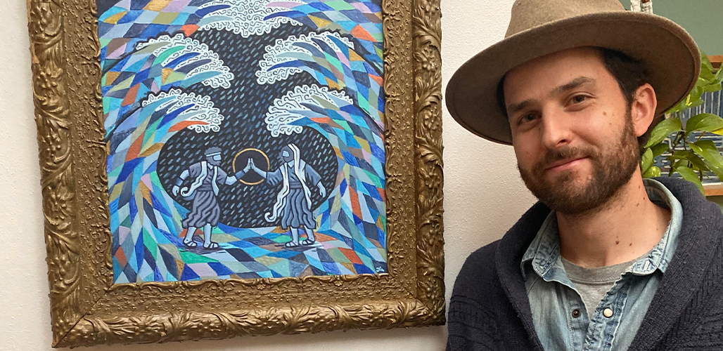
The Heart of the ArtistOne of the friends I’ve met on my art journey is an artist whose work is both instantly recognizable and endearing. Working with textures, colors, shapes, line, and smart design, Jonathan Shaw demonstrates a careful and loving approach to his artwork. Paintings are imbued with his unique vision, delving fearlessly into matters of faith, biblical history, and the person of Christ. These subjects are not new to art, having a rich history through the commissions of the church. However, in our modern world it takes a good amount of courage to embrace so fully the subject of religion, especially with the earnestness that Jonathan displays.

Besides the realm of glory, Jonathan’s art goes into wonderfully realized areas of whimsical design, with charming compositions and playful shapes and colors. His is an art that embraces imagination and creativity, being both conceptual and representative. It is always very clear that he has fun with his work, developing a visual language that easily and cheerfully communicates that fun to his audience. All of this is to say that I dig it. That’s probably clear by now.

Soft-spoken and friendly, Jonathan gives off a spark of lively spirit, being quick to smile and engage. His demeanor is often indicating his readiness to listen and enjoy others’ personalities. I was excited to learn a bit more about his process and history with his art.

Adam Kenney: Please introduce yourself.

Jonathan Shaw: My name is Jonathan Shaw and I am a freelance artist. My family had roots in the Colorado Rockies near Aspen but I was predominately raised in the Milwaukee area where I now reside with my wife, Kelsey, and our two young boys. I received my BA in Studio Art with a minor in Art History from Seattle Pacific University in 2010. I enjoy time spent with my wonderful family, mountain biking, grooving to good music, swimming in the beautiful Lake Michigan, being in the great outdoors, exploring the city, gathering with friends, and chatting about scripture. 

AK: What are your primary ways of making art?

JS: I am a multidisciplinary artist who works with paint, collage, illustration and a wee bit of design work. The majority of my subject matter involves Biblical narratives and Judeo-Christian themes portrayed playfully with paint and other media. 

When I was growing up, my father often traveled to a variety of foreign countries as a documentary filmmaker. I distinctly remember the time he returned from India with intricate woven rugs and blankets, carved wood jewelry boxes, and tiny painted stone animals. I was drawn to the beauty of the patterns, the aromas, and the exotic aesthetic. Experiences like this one from childhood have significantly influenced my stylized approach. Much of my work could be defined as whimsical folk art. I love incorporating patterns and symbols that poetically imbue the artwork with a meaningful message.

AK: How long have you been working with art?

JS: It’s certainly been a good long journey. I’ve been drawing ever since I can remember. My mum jokes that I drew before I spoke. I actually took speech classes with a tutor in Kindergarten and 1st grade because of my delayed verbal communication. I have always been a very meditative and visual processor which has definitely served me well as an artist. Throughout my elementary years, I faithfully drew with colored pencils in a couple of sketchbooks and as the years went on I got a taste for other media such as printmaking, collage, ceramics, jewelry, sculpture, and painting.

Shortly after graduating college in Seattle in 2010, I moved back home to my family’s farm in Wisconsin and focused my time on my art practice. Honestly there wasn’t much to do other than farm work, exploring our 160 acres of fields and forests and creating artwork. Although this season only lasted a year before jumping back into the “work force,” the time has been foundational to both my faith and my creativity. 

As a freelance artist, I’ve had the privilege to make my own personal body of work along with a variety of commissions from clients which has included published book illustrations, large scale murals, logo designs, websites, portraits, and collaborative projects. In summation, I’ve been selling artwork and have taken on commissions since 2010 while holding other jobs, but it wasn’t until the beginning of 2021 that I’ve done it full time.

AK: Why did you decide to make art a focus of your life?

JS: I hold a strong conviction that I was created to create. Nothing else grounds me in the present and helps me process life quite like creating art does; it’s very therapeutic for me. So after several years, I finally was able to become a full-time freelance artist. I know that if I looked back on my life and hadn’t used my creative gift to its fullest potential, I would really regret it. So here I am, pursuing my passion one step at a time.

AK: In what ways have you been changed by art?

JS: Art has taught me many valuable lessons and cultivated several beneficial practices in my life. Creating art has taught me patience, critical thinking, how to listen and observe well, and that life is a continual work in progress. Art has also allowed me to learn more about my subject matter whether that be nature, culture, or aspects of scripture.

AK: What is your primary focus when creating art?

JS: My primary focus when creating art involves a process of discovery. I tend to focus a lot on learning more about my subject matter; investigating and meditating on it. Similar to the adrenaline rush that comes from a good descent on the ski slope, creating art has an exhilarating effect for me; both in the discovery aspect and the mystery behind it. This dynamic keeps me coming back for more.

AK: What artists do you look up to or find inspiration in?

JS: I often resonate with the work of several 19th & 20th century painters such as Marc Chagall, Henri Matisse, Pablo Picasso, Vincent van Gogh, and Paul Cezanne, as well as self-taught folk artists. My favorite among this group is Marc Chagall. I’m fascinated by his whimsical and colorful depictions of Biblical narratives, childhood memories, Jewish practices, and dream-like scenes. I find his work to be so poetic, imaginative and graceful.

AK: How do you stay motivated?

JS: Over the years I’ve come to learn that creating art requires balance and that art is not the end-all-be-all. I’ve discovered that when I am flourishing socially, mentally, physically, and spiritually; creativity flows more effortlessly. Just as important as a well-rounded life, restoking the creative fire through being immersed in others’ artwork is very significant for my motivation as an artist.

Likewise, morning bike rides in the warm months have been very beneficial for me. It allows me to loosen my grip on the day and release any fears that I may be harboring. Reading books on creativity is also very helpful. I’m currently working my way through “Real Artists Don’t Starve” by Jeff Goins. Throughout the year I read Julia Cameron’s daily artist devotional called “The Artist’s Way.” I highly recommend both of those reads. 

A big motivation for me lately is being involved at a local gallery where I exhibit my work. It’s been so encouraging to meet other artists and to spur each other on. I am preparing for a solo-exhibition later this year which also keeps me excited and motivated. It’s encouraging to know that my artwork has and will touch people’s lives and that keeps me going.

AK: Do you have any regular rituals that help you keep your focus?

JS: A few things come to mind. Music has always played a significant role in my creative process. I find that tunes help me gain momentum and usher me into a good rhythm. Living a simple, down to earth lifestyle and being “close to the land.” This may look like taking walks with my family, tending to our garden or kayaking down the river.  Every once in a while I find it helpful to look at other artists’ work; both contemporary and from the past. This endeavor provides several benefits from feeling a part of a larger community to discovering “resonating voices” that harmonize with my own work. One of my favorite ways to do this is by going to Barnes & Noble and paging through art magazines or better yet, going to a local used-book store and finding old books of artists I like. 

AK: In the last year what has made the largest impact on your practice?

JS: I’d say the decision to resign as a mail carrier from the Post Office and taking steps to cultivate my art career full time. Leaving behind my postal job was a big leap of faith for me but it really allowed me to take myself and my artistic calling seriously.

Community has also played an important role for me in this season. Specifically joining an online art mentor group has done wonders; learning new skills, ways of thinking, and professional advice. Along with this online community, being involved at a local gallery and studio has made a large impact (and I mean local; the space is only three blocks north of us). It has been so encouraging to exhibit my work there and to speak with others at its open receptions. I am also currently taking steps to be an artist-in-residence at this studio gallery.  

AK: Do you think there is something missing in the “art world”?

JS: Great question. I honestly haven’t thought much on this subject so my thoughts may be a tad undeveloped but I’d say maybe opportunities for up-and-coming artists to find outlets for their young careers to take flight. This could look like galleries exclusively tailored towards emerging artists, more opportunities to learn from veteran professional artists, and various apprenticeships. 

AK: What would you like to see more artists do?

JS: Pursuing a creative career can definitely be difficult especially when doing it alone. I’d love to see more artists coming together to encourage and inspire one another. I’m casting a vision in my local area to gather artists to view and discuss works in progress and exhibit artwork together. 

AK: Any last keys to your art practice?

JS: I would say, having a renewed mind in Christ is one of the biggest keys for me. This allows me to create out of a place of affirmation, anchoring me in the Father’s love even when discouragement and disappointments come. One way that I remind myself of this is signing my work with the Hebrew translation of my name, Yehonatan, meaning “Yahweh has given.” I consider the ability to create a wonderful gift as well as a collaborative process with my Maker. My hope is that my artwork blesses and inspires others. 

AK: Where can people find you?

JS: Folks can find me on my website www.yehonatan-art.com

on my Facebook page www.facebook.com/yehonatan.art

or on my Instagram www.instagram.com/yehonatan.art

1. “The Heart of the Artist”
Watercolor, gouache, crayon, colored pencil on paper, 11×14” – 2021

2. “The Alabaster Jar (Tears, Hair, Kisses, Oil)”
Graphite, ink, colored pencil on paper, 9×12” -2021

3. “Open Table”
Acrylic paint on canvas, 30×40” – 2020