Posted on

Snowy Shell Station Painting Process

The local historic Shell gas station looked remarkably beautiful in the snow a few years ago. I knew I wanted to capture it as a painting someday. Here is a look at my process, with notes below.

shell station painting process
  1. The first layer of paint. I chose to use a cool tone, to infuse the entire painting with some cold unity. This layer of paint is thinned out by introducing some odorless mineral spirits and extra oil to my paint. At this stage, I’m only concerned with getting the general shapes of value in.
  2. Some more layers go down, with an emphasis on basic tones and colors. I am using a limited palette here, with burnt sienna, Payne’s gray, and hansa yellow. I believe I did use some raw umber and yellow ochre for a few of the areas and the general tone of the building. Of course, titanium white was also used to help lighten colors where needed.
  3. The finished piece. With the main shapes of color in, the real challenge at this point is to introduce more detail. As I move around the canvas, I am always moving back and forth, looking for areas to improve and change. It really is when the flow of painting happens and I’m following my instincts, trying to adjust everything until my heart and eye are satisfied.

Prints and greeting cards of Snowy Shell Station are available here and here, respectively.

Posted on

Cleaning Brushes of Oil Paint Easily and Correctly

shallow photography of brushes on jar

Oil Pain in the Neck

There is nothing quite like a new paintbrush. The bristles are springy and ready to apply paint to ground in magical ways. There’s also nothing quite like going broke from constantly buying new brushes because your old ones got caked in dried paint. It’s much less magical.

When we’ve finished a painting session, it can be really easy to slide into “relax mode” and put off cleaning brushes. Oil paint, in particular, is a bit of a tough customer. As we all know, oil and water don’t mix, which means it won’t be as easy to get that paint out of those bristles as it might be with acrylic, watercolor, or gouache.

And yet, we love oil paint. We thrive on it. So, what do we do when our brushes get consistently bent out of shape from neglect? Well, we would love to have an easy time restoring them, but if things have gone too far, we’re up a creek without a paddle.

If your brushes have become solid oil rocks, there’s really not much you can do. I’ve seen articles and forums that suggest soaking them in vinegar or solvent for hours and days, but at that point, it might not be worth the effort, as your brushes may not be usable by the end of the process. I’m speaking from experience.

With dirty brushes, you end up losing money over the long-term. New brushes aren’t exactly inexpensive, especially if you’re buying decent quality or larger sizes. So, whether you’re already in a predicament or you’re just doing some research to understand how to clean your brushes correctly, I will explain a good process and practice for extending the life of your brushes.

abstract art artist artistic cleaning brushes
Photo by Pixabay on Pexels.com

Cleaning Brushes Immediately

Seems simple. I won’t even harp on this one too much because it is probably the most obvious statement. However, if ignored, the whole process becomes so much more difficult.

Anything we do regularly and with discipline can eventually become habit, so I would just recommend that you try to schedule the time into your practice to clean your brushes. It might be easier if you think of it as part of the process of painting.

I will also add, before we get into the practical cleaning advice, that you don’t want to overload your brush with paint while working. There are different techniques to painting, but most still don’t call for paint to be at the deepest depth of your bristles.

person wiping a paintbrush cleaning brushes
Photo by cottonbro studio on Pexels.com

Step 1: Gently Remove Excess Paint

The first thing you want to do when cleaning brushes is to remove excess paint. To do this, you will need either paper towels or newsprint. Rags can also be used, but it is important to understand that oily rags can be dangerous, becoming easily flammable in high heat.

Place the bristle end of the brush in the towel and pinch the bristles with your fingers from the outside. Then begin to pull the brush through, repeatedly. You will have to shift to clean areas of the paper towel, as the pigments will rub off on the paper. If the brush still is not clean by the time you have used the entire paper towel, you may need to get a second one.

You want to get to a point where the brush is not transferring any significant amount of residue to the paper towel. At that point, you can move on to the next step.

water drop
Photo by Pixabay on Pexels.com

Step 2: Use a Cleaner

Safflower oil or special soaps made of oils can be very helpful for loosening the pigments from your brushes. There are specific brush soaps on the market that can significantly help with the cleaning and conditioning of your brushes. I really like the Master’s Brush Cleaner and Preserver and find that it works wonders for my bristles. It works like shaving soap, where you add a little water, rub the brush into it, and work it into a lather. Then you can use your hand under running water to remove the rest of the pigments from your brush.

Remember that at this point there shouldn’t be a whole bunch of paint on your brush, so it’s not going to be an extremely messy process. You are just removing those last amounts of pigment from the bristles.

If you don’t have the specific cleaner I mentioned above, you can still do a similar process using regular hand soap or even dish soap. You can place a little bit of soap into your hand, add water, and work the brush through your fingers, using the soap and lather to free up the pigment, then run it under warm water.

Many people do not like the idea of pigments or oils being worked by their hands, directly, and will use gloves as a protective barrier against them. While most pigments these days are safe to work with, this is a safer method for cleaning brushes.

brown and silver makeup brushes
Photo by Dids on Pexels.com

Step 3: Dry Those Brushes

Cleaning brushes is pretty easy, right? Now, we just dry them. You can use a clean towel or rag to dry the bristles, gently removing any leftover wetness. The bristles will most likely retain some amount of moisture and remain damp for a little while, so let them sit and dry until they are ready to be used again. If you try to paint with a damp brush, you’ll have a difficult time with the oil paint.

If, while drying, you notice that the pigment is coming off onto the towel, you will want to repeat the cleaning process, because you didn’t get the brush clean enough. Any amount of leftover paint can create problems in the future, so you want to be sure to clean thoroughly.

yellow and black striped
Photo by Ash @ModernAfflatus on Pexels.com

Do I Need to Use Solvent?

Solvent (turpentine, odorless mineral spirits, paint thinner) is a highly hazardous liquid that eats away at organic materials, such as oil. It is often used by oil painters to adjust the ratio of oil-to-pigment in their paints and can also be used to clean paint from bristles. Many people might use it when cleaning brushes when they don’t need to. It is of utmost importance that you understand the risks and proper handling of solvent before you ever use it.

You can never dispose of solvent into your drains or plumbing, nor can it be disposed of in the garbage. It can also not be poured out into the ground or water. All attempts to dispose of solvent in any of these ways is terrible for our environment and also illegal. Cities, counties, and states should have some way in which you can legally throw out solvent.

If you use solvent at all, it should always be in a highly ventilated area, as it has fumes and can harm you. Solvent will evaporate over time. If it does so, it is safe to dispose of the dry remnants left behind.

Now, do you need to use solvent? The short answer is no. There are alternatives that can work just as well, mentioned above. Solvent can be used to dissolve the paint from your bristles, much like water can be used with acrylic paint. It can make quick work of it. However, in my experience, solvent can also be very hard on the life of your brushes, too. You might find that your bristles aren’t exactly what they used to be if you use solvent often in cleaning brushes.

person holding paint brushes
Photo by Anna Shvets on Pexels.com

Simple, Right?

That really is all it takes to keep your brushes clean and ready to work with.

  • Remove excess paint and pigment with a paper towel
  • Make sure that there is very little, if any, pigment transferring from the brush to the towel
  • Use soap or oil brush cleaner along with water to loosen and remove remaining pigment
  • Dry the brush manually, then let it sit

I have also heard of artists using a little bit of conditioner occasionally to keep their brushes shaped nicely. I don’t know if that is necessary, but it probably wouldn’t hurt to try it and do it very rarely.

I hope this has been a helpful look at cleaning brushes that have been used to paint with oils.

If you’ve found yourself dabbling with oils and want to learn a bit about color mixing, head here.

Posted on

3 Helpful Features of the Primary Triad in Painting

Before we Hit the Triad

In art, we can define the Primary Triad as a “color scheme”. There are many color schemes that an artist can use to create the impression they hope for. A color scheme is the artist’s starting selection of colors, usually based within 2-4 different hues. Many established schemes exist and are seen every day, in advertising, movies, and print. A scheme is essentially a formula to derive a set of colors from the traditional color wheel. It helps artists maintain a consistent focus of color with their designs.

Some popular color schemes are:

  • Monochromatic
  • Analogous
  • Complementary
  • Split-Complementary
  • Triad
  • Tetrad

Today, we will focus entirely on a particular type of Triad scheme: the Primary Triad. And, while the Primary Triad can be found all throughout our media world in its most pure and unblended form, we’re going to discuss how it lends itself beautifully to a painter’s palette.

Primary Triad Basics

What is a Primary Triad?

The “Triad” finds its meaning in the number 3. All Triad schemes consist of 3 colors.

The “Primary” finds its meaning in the particular selection of colors – Primary colors. Namely, red, yellow, and blue.

Putting both words together, we can understand what we are dealing with. A Primary Triad is a color scheme based solely in the colors red, yellow, and blue.

The next time you’re looking through an advertisement for children’s toys, pay special attention to the color choices. You will often find that the Primary Triad is used commonly to appeal to kids. Not only is it a very basic and consistent set of colors that can be easily identified, but the colors also operate together to create a huge amount of visual interest.

Yellow and Red are often used to grab attention, with their strong and vibrant hues. Blue is a nice counterbalance to them and offers its own intense and pleasing color. Putting these colors together, you find a large amount of visual vibration, as they play off of each other in a balanced and visually stimulating way. In fact, the Bauhaus School often revered red, yellow, and blue as being central to art and our understanding of color.

But it’s not just these three colors alone that make them so suitable to painters…

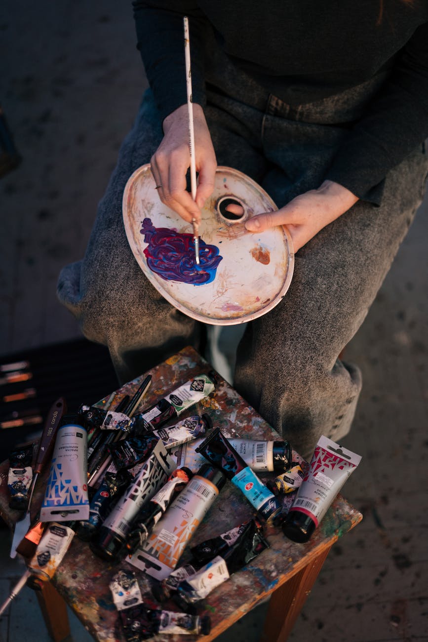
Feature #1: They Mix Well Together

When you start with a Primary Triad, it makes it much easier to mix a wide variety of colors. You probably remember being in elementary school and learning that red and yellow make orange, red and blue make violet, and yellow and blue make green. This basic formula has helped artists for centuries.

Orange, violet, and green are known as “secondary colors” and what’s magical about them is that they feel completely different from the primaries. You can see the way that they link together, but they also set themselves apart as unique hues.

Let’s look at a twelve-color wheel for a second.

primary triad

You’ll notice that the primary colors and secondary colors also have colors between them with names that combine their neighbors, primary-first. So, the color between red and orange is known as red-orange. These are called tertiary colors. And if we were to create a 24-color wheel, we would see even more bridging hues. We can even break it down further if we want to.

What is remarkable about this is how fantastic our primary colors are at creating other vibrant colors and how many colors we can create when we mix them together in different ratios. This is worth exploring and I would recommend that you experiment with your primaries to see how many colors you can create!

Feature #2: But, wait! There are even more colors!

Ever wonder how you mix a brown? I remember as a kid, I asked my mom how to make brown with the crayons I had. She said to mix red and green. She was right!

However, that’s not the only way you can make brown. There are dozens of ways to do it. There are even many ways to shift the brown exactly to where you want it to go, whether it’s more of a red-brown or a green-brown. It all has to do with complementary colors.

First, let’s define what we’re talking about. We already talked about those vibrant primaries, secondaries, and tertiaries. When they are at their fullest, they are often referred to as “pure” hues. Now, we’re looking at neutral hues. These are the muddy colors, like brown or gray.

A neutral hue is created what you combine complementary colors. Complementary colors are on opposite sides of the color wheel from each other. For instance, orange and blue. Yellow and violet, too. Pick any color and trace a line directly to the opposite side of the wheel – there you will find the complement.

Now, I want you to notice something awesome. I mentioned combining orange and blue a moment ago. Well, blue is a primary color and orange is a secondary, made up of red and yellow. So, in essence, we are combining our primaries to create those neutral colors. This is incredibly insightful for artists who may have mixed a neutral color and it just isn’t coming out right.

Let’s say you mix you are painting a yellow flower. As you move into some of the shadowed areas of the petals, you see that you need to mix a neutral color. You rightly think to use violet in combination with yellow. However, as you mix them together, the neutral is coming out too green. Why is that happening?

It’s because your violet is actually bluer than it should be. Remember, when yellow and blue are mixed, you get green. If you want to tone down that green, you will have to add some red. Which makes sense, because red is the complement of green and will reduce the greenness of your mixture!

With the Primary Triad, you can create so many colors! Also, remember that you can add white to lighten any of these colors and black to darken any of them. That gives you a whole cornucopia of colors to work with.

Feature #3: Color Harmony

Do you ever go to your box of paints, not knowing which ones to choose? Maybe you’ve grabbed upwards of ten different tubes in the interest of getting a good variety of colors on your canvas. However, once it comes time to paint, you look at your palette and find yourself overwhelmed by the options. Eventually you just start choosing colors and hoping they will work. An artist who chooses colors randomly will always struggle to achieve color harmony.

Instead, let’s simplify. Using a Primary Triad will teach us how to economize and understand color relativity much better. It is vitally important to understand that colors act in relation to each other. They are often understood by the artist and viewer within their own framework. As an example, look at the painters of the renaissance. They had a very limited selection of colors to work with, mostly earthy in hue. Yet, they created masterworks of art, many of which read far more colorfully than we might expect.

This means that we, as painters, can also simplify our colors. In doing this, we will prevent ourselves from being overwhelmed with choices and we will also increase our understanding of color, as we utilize a limited palette of pigments. We will see firsthand how colors will work together to communicate exactly what you hope they will, even if you weren’t expecting them to.

A Primary Triad is a wonderful starting point for painters interested in imbuing their work with harmony. When you have fewer colors to choose from, you have far less chance that your colors will clash. Yes, a blue in real life may not be exactly the blue paint you have in front of you, but maybe you can mix one with what you have. Not only that, but it may not actually matter as much as color harmony does.

I think the most remarkable thing about using the Primary Triad as your starting palette is that it achieves that color harmony while still granting you so many color options. It’s like playing in a sandbox where every toy makes sense and works together to make the whole experience fun.

Next Steps

blue red and yellow stripe surface primary colors
Photo by Magda Ehlers on Pexels.com

Now that you understand the simplicity and flexibility of the Primary Triad, I hope that you will use it yourself. A recommended set of colors that will get vibrant results are Pyrrole Red, Lemon Yellow, and Ultramarine Blue. However, you can experiment with different pigments in place of your primaries.

Try:

  • Burnt Sienna, Yellow Ochre, Payne’s Gray (very earthy and natural colors)
  • Quinacridone Red, Indian Yellow, Phthalo Blue (probably going to get some interesting greens here)
  • Alizarin Crimson, Cadmium Yellow, Cobalt Blue (pretty vibrant, with a good chance for nice violets)

These are just off the top of my head. Experiment with your own combinations. Also, remember that replacing one of the primaries with a neutral will still have a nice harmonious effect and may even spark some creativity.

Have fun trying it out!

Check out this great color wheel resource, here!

I also wrote up a little article about Three Strong Strategies for Mixing Colors.

Posted on 2 Comments

3 Strong Strategies for Mixing Colors

a painter mixing paint on palette using a paintbrush

Keeping it Simple and Easy

Mixing colors is something that every artist has to do at some point. As an oil painter, I find it to be one of the most important elements that has to be done right to get good results with my artwork. There was a time when I was oblivious to it, then a time when I realized the significance and challenge of it. Now, I mix my colors with much more confidence, and you can, too.

I have 3 easy and strong strategies that will help you get the best results from your color mixing, whether you mix your paint before or during your painting practice. These are the most basic and effective strategies for mixing colors, so don’t be surprised if you think it sounds too simple.

You will not have to learn complicated color theory concepts. While those can be incredibly helpful in the long run, I want to help you get the most bang for your buck in the shortest amount of time. You can implement these strategies with any form of art that uses color pigment, whether it is acrylic, oil, watercolor, gouache, or any other medium that will allow for the tiny pigment particles to mingle and party together.

A quick note regarding these strategies: they can work simultaneously. However, I have divided them out into a process that prioritizes the most important elements of color. With enough practice, it won’t be long until you’re using these strategies in unison when mixing colors.

We will start by establishing the 3 central concepts that make up color. It is important to give these some good attention, because understanding them will be integral to mixing colors with confidence. Each section has tips that will expound on the simple concepts with illustrations to help guide your learning. At the end of this article, I give you a basic application of these 3 central concepts.

Let’s dive in!

Know the Value of Value

close up of a blue paint mixed on a wooden palette
Photo by ROMAN ODINTSOV on Pexels.com

In art, “value” is the word that describes the lightness or darkness of a color. If I were painting a still life, the shadows would be considered darker values than the highlights, which would be lighter values. Everything we see around us can be defined by their values and there are a wide range of values that our eyes can differentiate between and identify.

Values help us recognize forms and differences between objects through “value contrast”. When one value sits next to another value, the differences are often very clear, especially if the values are widely different. Our eyes are incredibly attuned to recognizing values and the forms that they imply, as it is the main task of our rods and a secondary task of our cones to perceive those shifts in value.

Simply put, light shines into our environment, our eyes see the variations in illumination, and our brains recognize the objects around us, mostly so that we can navigate and understand our surroundings.

When we paint, it is vitally important that we first recognize the values of the subject we are painting. Many oil painters start with the darkest values and work towards the lightest over time. This technique can be very helpful for keeping our values straight and understood correctly. If we are true to the value relationships of our subject, it will become very clear what we are trying to represent. Remember, it’s those values that communicate the forms of the objects we are painting and we are trained to recognize objects through those forms. Therefore, realism relies upon those values.

Think about black and white photography. Even without any hue or color intensity, we can still understand what we are seeing. That is all thanks to value and the forms that are described by the shifts and contrasts between values.

To apply this to your painting process, you will want to practice seeing and recognizing how light or dark the color you are trying to replicate or create should be. If you are a representational painter, pay close attention to those values first, then move your mind towards the next two strategies as you are mixing colors. If you are an abstract painter and mixing colors, think about the contrasts that you will create through value.

Identify the Hue

smudges of paint on a black surface
Photo by Susan Wilkinson on Pexels.com

Once the value of a color is observed, we can jump into recognizing the “hue”. Hue is just a fancy word for the basic color we are seeing. So, yellow is instantly recognized as a “yellow hue”, different from red, orange, blue, green, etc., based solely on its position in the color wheel and its essential family of hues. This is best expressed visually. Let’s look at the color wheel below.

mixing colors

Notice how it is divided up, with each section labeled. Those labels are the “hues”. They are defined as the family of colors that sit within a section of the color wheel or color spectrum. These labels are usually what we think of when we consider and talk about colors. I might say, “This is red and that is yellow.” You would understand what I mean without many, if any, questions.

When you are mixing colors, you will need to identify the hue that is most recognizable. A color that has no neutrality (“grayness”, “brownness”, or “muddiness”) is known to be a “pure” hue. When a color is very pure, the hue is far easier to identify. You still need to be careful and consider if the hue is between two hues or leaning in a certain direction. For instance, a red that you observe might lean towards red-orange or might lean towards red-violet. Knowing what the hue is doing will help you recognize the color of paint you should start with or what colors you should try mixing together.

Establishing a knowledge of the color wheel is indispensable. Break it down into sections. There are 3 “primary” hues: red (R), yellow (Y), and blue (B). These create the “secondary” hues: orange (R+Y), green (Y+B), and violet (R+B). “Tertiary” hues are those that reside between primaries and secondaries on the color wheel. These are yellow-orange, red-orange, red-violet, blue-violet, blue-green, and yellow-green. The 12 hues make up the basic color wheel that artists and designers often use to plan their color schemes and understand the working relationships between hues.

Once you understand hues, you will have a better time choosing what paint to use when mixing colors. For instance, if you want to mix a red-violet using a red paint and a blue paint, you will be better off starting with a more violet red (such as Quinacridone Red or Alizarin Crimson) and a more violet blue (such as Ultramarine Blue). If you were to mix an orangey red with a greenish blue your results would not gain you a vibrantly pure red-violet, but something more brown.

The above graphic shows popular and common pigments placed where they would belong on the traditional color wheel. This can help inform your decisions when selecting paints for mixing colors. Know that when you are mixing colors from pure pigments, you can guess what the results may look like by drawing a straight line between them on this graphic. The middle point on the line will be the average of the resulting mixture.

Knowing your hues makes it a lot easier for mixing colors. It also helps you communicate about color and even spot differences between similar colors, especially those that are “gray” or “brown”. A gray can be “reddish” or “blueish” or “greenish”, etc. Same with a brown or other neutral color. This will bring us into the next section.

Mixing Colors with Intensity

Vibrant red and yellow tulips

Colors cannot be defined only by value and hue. There is an element that speaks to the vibrancy, intensity, or chroma of a color. Intensity relates to that “pure” notion I discussed earlier. A color that is high in intensity will be very vibrant and close to its pure hue. We see that in the flowers shown above, as they radiate pure hues of red, red-orange, and yellow.

Many colors we see do not fall within easily-defined hues. They are lower in intensity and, therefore, harder to associate to a pure hue that they are derived from. These kinds of colors can be known as neutral or muted colors. What do we do with those?

When confronted with a neutral color, it is important to identify what hue the color is closest to. Then we can create a plan for mixing colors. For example, if a neutral color is reddish (often described as “warm”), we want to start there, then introduce paint colors that will bring our mixture closer to the observed color.

Composition in bright colors with gray
Muted neutral colors

There are many ways to neutralize a hue, but different approaches get different results.

If you want the neutral color to retain some of its intensity (not becoming too faded, but remaining strong in color), you need to introduce its “complement”. The complement of a hue is the hue on the opposite side of the color wheel.

As an example, red would be neutralized by green. Introducing just a little green will result in a reddish-brown. The green can either be one distinctly green pigment or the combination of pigments, such as yellows and blues. The less green we introduce, the more red our brown will be, and the more we introduce, the more green it will be. We can also try to introduce more blue or yellow, depending on if we need to pull or push the color in a different direction.

Mixing colors can feel very confusing at first! I know a lot of students that I have taught who really struggled initially to understand how to achieve certain colors with their paint. It really just takes some practice.

Faded or muted neutrals can also be mixed by introducing white, black, or gray. White lightens your hue, known as “tinting”. Black darkens the hue, known as “shading”. Gray desaturates your hue, known as “toning”. All three will lower the intensity of your colors, making them less vibrant. One of the most common painting errors is to introduce white as a brightener. However, while white does lighten, it doesn’t brighten (in the sense of increasing vibrancy).

Applying These Strategies

Paint on wall

Now we understand the three basic characteristics of color: value, hue, and intensity. Every color is going to have some element of each characteristic.

How do we use this knowledge for mixing colors? I have a little rundown of how you might approach mixing colors to match your reference.

First, note the value. Is the color dark? Is it light? Somewhere in between?

Then, note the hue. Can you recognize any? Where does it lean? Compare it to surrounding hues.

Lastly, note the intensity. Would adding white, black, or gray result in the color? Or do you need to keep things more vibrant by mixing together complementary colors?

Soon, you will be making these judgments without even thinking too much. Your color recognition and knowledge of your pigments will increase, you will grow in confidence, and your instincts will gain a more solid and sophisticated foundation. Mixing colors will become completely natural.

Finally, I would recommend that you start painting with a limited palette, if only to understand how colors can interact. A limited palette is a simple selection of colors, usually a red, yellow, and a blue, along with white. Try different combinations (Pyrrole Red, Lemon Yellow, Ultramarine Blue; then Alizarin Crimson, Yellow Ochre, Phthalo Blue, etc.). Try switching out a pure primary with a neutral color (for instance, use red, yellow, and Payne’s gray instead of blue). You will start to learn, firsthand, how these colors interact and the color wheel will become alive in your mind.

Read more great color advice with James Gurney’s book “Color and Light”, found here.

If you’re interested in oil painting, read my invitation and encouragement to you here.

Posted on

Artistic Inspiration from Gorgeous Suncadia, Washington

Trees on a Hill Oil Painting

A Short Hike Brings a Beautifully Simple View

Psst. Hey. All you workaholic artists out there, let me tell you about a time I had some easy artistic inspiration without burning myself out…

When was the last time you took a break from bending over your easel and decided to go outside? Believe it or not, there’s more to life than putting paint to canvas or pencil to paper and maybe it will just get you excited to share it -visually! – with the world.

A good friend invited me on his birthday trip to Suncadia, Washington a couple of years ago. We golfed (poorly) in the sun, played some fun games, and had all sorts of great conversations. Not only that, but we went down this enormous outdoor staircase that led us to a running stream where we spent too much time skipping rocks and challenging each other’s throwing accuracy.

On our way back up the hill, I saw a beautifully simple little sight. Sunlight was filtering through the branches of a small crop of trees sitting on a tiny hill. Something about it hit me in a way that I wasn’t expecting. It spoke of lazy outdoor days, enjoying the sun’s warmth when there’s still a little chill in the air. Being without paint and unprepared to set up for a painting, I snapped a quick picture for use later. Being that I had some artistic inspiration, I was determined to paint this piece.

The reference image.

Laying Down the Right Foundation

When I arrived home I decided to set to work on the painting. I selected a small canvas (10×10 inches) that would serve to display the setting with enough detail and impact, though not overwhelm the viewer in its size. I really felt the small canvas would help to serve the simple nature of the scene, not overcomplicating things with massive presence. I also just wanted to work small.

I had been working a lot with limited palettes at the time of this painting. A limited palette is an approach to painting that encourages the artist to choose as few paints as necessary for the project. Color is very relative and this creates a framework for the artist to work simply. I chose Yellow Ochre, Burnt Sienna, and Phthalo Blue, along with a White (can’t remember if it is Titanium or Zinc) and Raw Umber. This allowed me to get a good range of colors without getting overwhelmed by a huge selection of paint options. I often use Winsor & Newton oil paint (they have a wide range of qualities that can fit any person’s budget).

Getting at it quickly was pretty important for me. I wanted to really make sure that the painting had a good amount of life to it and I truly believe that the more free a painter’s strokes are, the easier it becomes to imbue visual interest. The way we use our paintbrushes can absolutely communicate how we are feeling, in subconscious ways that even unaware viewers can perceive. It’s like talking on the phone in a good mood versus a bad mood. It can be heard in the voice, despite any of the word choice.

Using a stiff brush allowed me to get some nice textured and lively strokes on the canvas. Having that right amount of tension from the hand to the brush to the spring of the canvas imbues the painting with a personality that may not come through in just the colors and composition. I ended up being very happy with the way the preliminary layers were coming together.

Overall, I wanted to make sure that my enjoyment of the outdoors on that trip to Suncadia would come through in the painting. I always seem to work more enthusiastically when I experience the artistic inspiration that quiet and peaceful moments can provide – it would be very satisfying to communicate and share that expression with others.

Before I added more details. Maybe I could have stopped here!

Things that Did Not Work

Despite all of the early artistic successes with the piece, I didn’t know when to stop. That’s a huge learning curve for painters. Maybe it’s weird to hear an artist question their judgment on their own blog that’s part of their website where they run their business. I think it’s more important to be honest about how I was feeling regarding my work. I just didn’t know how to maintain the freshness of the painting, as I added more detail and more layers of paint.

Let this be a lesson to you! And me. I don’t think my painting is bad, by any means, but I do wonder if it could have been better if I had left it alone or been more selective with my “improvements”.

The colors were also a learning experience for me. While I am fond of the painting, I do think that some of the colors were really challenging. The thing about direct sunlight is that it can reflect off of surfaces, such as grass, and become very bright. However, in doing so, it loses a lot of the intensity of color that we hope to find in paintings. So, there’s a choice that the artist has to make, which is between adherence to realism and adherence to visual interest. I’m not sure there is a right answer, but I do wonder if I chose the correct path.

One technical thing that can add to the difficulty in painting with enough color intensity is the photo reference. Great photos are the result of a good photographer and a great edit. Cameras don’t work exactly like our eyes do, so there can often be a big difference between the way we see something in person and the way it comes to us through a photo capture. Contrast, brightness, intensity, and even perspective can be altered in a way that is just not as satisfying as what we are seeing in person.

If you are experiencing any issues like these that are getting in the way of communicating your artistic inspiration, I would recommend trying to find ways to introduce saturated and intense colors. Just try it in a few places and you might find yourself thinking entirely different about your painting. You may even be encouraged to increase the vibrancy of all your colors.

The Big Finale

The artistic inspiration came to fruition, eventually, when I put down my paint and brushes and called it. Happily, I walked away from the painting feeling like I had accomplished something decent and learned a lot along the way. That really is what I hope for most when I paint, that I will learn something. And most times, I do.

So, I added texture, color, balance, harmony, and eventually my stamp of approval. I do not think it is my greatest painting, by any means, but I do look at it occasionally and find myself studying aspects of it, with a grateful heart and a happy smile.

Here is a short series of three phases of the process. You can see how I started, began to adjust my colors, and then did some final adjustments to bring some more interest back in. Scroll back to the reference to see the changes I made, the things I de-emphasized, and the creative choices I made in a journey to simplify and economize my colors. You might also notice how my limited palette did in replicating the original colors.

While the first image in the process has a nice earthy quality to it and a good balance in the values, I do recognize the polish of the final image and how it conveys the textures and features with more crispness. I think I could balance my strokes a bit more, in hopes to keep that casual feel that is happening in the first image. I also could stand to control my use of white a bit.

So, there’s another Art Story from me, giving you a little background on one of my paintings. I’ve always enjoyed getting some behind the scenes looks at how people work and what they think of what they’ve created (warts and all). I hope you enjoyed this post and will find yourself in the midst of artistic inspiration sometimes soon.

You can find a print of this painting here.

You can also read my Art Story about my Haystack Rock painting here.

Posted on

Dealing with the Inner Critic

man in blue and brown plaid dress shirt touching his hair

When it All Feels Pointless

Man, oh, man… I just had a day that made my head spin. I started questioning everything I was doing. A funk fell over me and I had the greatest urge to give up on my projects. Every goal and passion that I had been emphasizing so heavily felt unreasonable and poorly planned, lacking creativity and value. It felt like I was in one of those dreams where I was walking around thinking I was fully clothed, only to look down, becoming horrified by my nakedness.

Damper fully engaged. Everything grinding to a halt, the negative thoughts started to pour in. Why haven’t I achieved more? Why didn’t I focus more when I was younger? What have I really been doing with my time? Why don’t I understand more? Why are my skills so unrefined? There seem to be so many others who are thriving, understanding everything they’re doing, planning things so skillfully. Why can’t I figure it out? What is wrong with me? Why am I so dense? What’s the point of what I’m doing?

The Noise

I have been putting a new emphasis on Instagram lately, trying to post more, interact more, and engage with the platform in meaningful ways. There’s a lot of floundering that happens. An idea doesn’t quite go as well as you hope, a video feels rushed, a post gets less attention than you think it deserves – there’s so much room for expectations and disappointment. However, I still feel engaged by it and it is a creative challenge and outlet that gives me new opportunities to communicate. The frustrations of creation, while still very real, are not what actually led me into my existential crisis.

It’s the comparison game. The feed is a constant reminder of the difference between my posts and those of others. People with better cameras, better ideas, better artwork, larger audiences, more comments, more likes, more shares, more sales, higher prices, and more success. Most days I can look at other peoples’ successes and view them as inspiring – something to shoot for. This was not one of those days. I started comparing.

Comparing is the epitome of a double-edged sword. In many ways and for many reasons it comes naturally. We want to make sure we’re aware of things that we could do differently or better. I was always the kid in the stage performance that looked at the other kids and mimicked their movements in order to make sure I was doing things right. I didn’t want to be embarrassed by screwing something up. Being aware and discerning can often rely upon our observing of others and relating those observations to ourselves – comparing.

But the darker road of comparison is ever present and easy to walk down. Once I step foot on that path, it doesn’t lead to anywhere good and it’s hard to find my way back to the gentler road. It leads to anxiety, depression, and doubt. All wisdom starts to fade, all patience disappears, and all reason is doused. It really feels like you can see the end of the road right in front of you and it will not change in any way. Your life is doomed to be exactly what it is in this moment of frustration, forever.

The Answer to the Critic

I’ve heard it said that we are all our worst critic. I don’t think that means we’re always hard on ourselves, but that when we are hard on ourselves, we are REALLY hard on ourselves. We take it to an extreme. Ultimately, we’re calling into question our plans, goals, identities, and anything else that is integral to our self-image. It creates a feedback loop that gets louder and louder and more invasive and more powerful as we spend our time thinking about ourselves. And it’s not a great idea to be thinking about yourself constantly. As Proverbs 18:1 says, “Whoever isolates himself seeks his own desire; he breaks out against all sound judgment.” Notice how “sound judgment” goes out the window when we’re focused on ourselves and our own desires, wants, and independence.

So, how did I escape my funk? It wasn’t through willpower or doubling down on my efforts. It wasn’t through working harder and getting more accomplished. It wasn’t through dedicating myself to more things that would cater to my whims and emotions. In fact, I find that when I try to put a balm of pleasure over my open wounds, I actually am just making things worse. A video game, an unhealthy snack, an internet binge – those things have a way of making me feel even more pathetic. No, the answer didn’t come from self-indulgence.

The good side of the road came into view somehow. Instead of comparing, I began to think creatively – hopefully. I started celebrating the successes of others. A couple of encouraging posts on Instagram, one from Brainard Carey and another from Jim Musil, helped me see the value of my work as an artist, prompting me to comment my gratitude. The work of Erin Hanson, especially her business acumen, got my mind working about what I can do to actively improve my business. My wife came home from work. We talked about our days. I talked about some of the things that I want to do with my work, which she supported. That evening I spent time with friends playing board games. Over the weekend I attended church and played guitar with the worship team. Time moved forward. Patience, wisdom, and reason rose to the surface.

The critic was silenced by a refreshed desire to look and live outward. Relationships and follow through, culminations of selflessness and thankfulness, acted in quelling my emotions and bolstering my stability. I felt like I could go on. I could be excited again about what I was doing. I could put failures behind me, learning from them. I could move past the criticisms, not ignoring them at the expense of discernment, but also not giving them the power to call everything into question. Leaving them behind me, in the past.

A New Day

There are lots of reasons why the inner critic might raise its head in your life. Many times, we can learn from that critic. It’s why I titled this “Dealing with the Inner Critic”, rather than “Silencing the Inner Critic.” I think the inner critic has a role to play in our lives. We can just give it too much power, too much emphasis. Possibly some questions you might ask yourself when the inner critic surfaces are, “Where is this coming from? Where is it leading?” Comparison? Fear? Embarrassment? Hopelessness? Isolation?

Or could it be growth? Humility? Strength? Wisdom? Patience?

We are only human. We will have terrible days. There is no way to avoid them. Just know that they are not the end of the road. There is still much to be done. You have a lot to contribute. You are valuable. You have worth. The things you make and do are treasured by somebody. Look outside yourself. You might find that when your inner critic is too overbearing, somebody else’s encouraging words can quickly put it in check. And maybe your words can do the same for somebody else.

Posted on

Making Your Own Art Show

colorful arts hanging on wall

Opportunity Knocks

So, you’ve got an art show coming up and you want to make sure it’s a fun and professional experience for all visitors. Maybe you’re hoping your art will make enough of an impression for some sales. Or you just want your work to be experienced to the truest degree. I’m going to walk you through the basics of getting that show ready for the public.

Making Your Selections

assorted paintings
Photo by Medhat Ayad on Pexels.com

The first thing to figure out is what you are going to be showing. Wouldn’t be much of an art show without a selection of art to display. This process can rely on what kind of art you create and how much you’ve accomplished over recent years. Perhaps you have a series of works that are meant to go together – making this process a little easier. However, you might be doing more of a retrospective or a hodge podge of work that represents things you’ve made over the last decade or more. Or maybe you have enough recent work to fill a library, so you have to whittle down your options a little bit.

First thing, know what the goal is. If a curator is asking for specific examples of work that you have, then it won’t be as free-form as putting together an array of your work. Once you know your goal, the selections become easier. If your goal is to display lots of small intimate work, then it wouldn’t make too much sense to have large bombastic pieces everywhere. What’s the feel of your show? What do you want your viewers to leave reflecting on?

If you have a wide assortment of pieces that you just can’t decide between, it’s time to exercise those creative juices and decide upon a theme. Much like an artist might do when it comes to developing an idea from thumbnails to finish, you could break out the sketchbook and start jotting down ideas or sketching out thematic options. You will have to trust your gut when it comes to the harder choices. Remember, your work will be up for the public and you want it to be a reflection of all the things you love!

Putting Together the List

person holding blue ballpoint pen writing in notebook
Photo by picjumbo.com on Pexels.com

Once you have your selections, start putting it down in a list. This is going to help you wrap your head around what you’re showing. It will also give you the opportunity to title things that are not yet titled. Along with titles, you will want to put together whatever pertinent information there is for each piece, such as the dimensions, the year it was made, and the medium. If there are pieces that are on loan from any private collectors or institutions, you’ll want to indicate that by saying something like, “Courtesy of the Gallagher Family” or “Private Collection.”

This list is going to help you make sure everything has a name and set amount of information. It will build your confidence that you have what you need for the show. And it’s just a great way to compartmentalize and condense what might be an overwhelming amount of visual and mental information. Don’t put this off to the last minute because sometimes specifics can be hard to find or remember, such as dates and dimensions. This can also be a great time to start thinking about prices and placing them on the list, too.

Name it! And Write About it!

crop artist with painted spectrum in notebook
Photo by John Diez on Pexels.com

Name that show. What is going to summarize the work? This is up to you. My tendency is to keep the name simple. My most recent show was called “Discoveries.” This felt like a nice summation of the paintings I had on display and the logic behind my work. You can name it whatever you want, though, and in your own style. Perhaps you like more information or more vagaries. This is a creative element and you should own it.

Then you should write about it. Have an artist’s statement. I’ve read many a statement and there are so many that feel overwrought, overly impressive, hard to read or understand, etc. My advice would be “keep it straightforward.” Write down the most important elements. Then read through what you’ve written and rewrite it. I would aim to read and rewrite a good handful of times. You want to tighten everything up and present the ideas as clearly, yet artistically, as possible. Most artist statements I’ve seen end up being 3-4 paragraphs on one page. You want something that won’t take up everybody’s time. You may want this artist statement printed out on a number of takeaway papers or postcards, so that people can grab one and read it on the go, rather than standing in one place, reading from the wall.

Odds and Ends

black claw hammer on brown wooden plank
Photo by Pixabay on Pexels.com

Do your works need frames? Do they need hanging wire? Do you have time to sign any of them, if they are not signed? Getting some of the missing stuff together can really help make your show feel much more professional. I recommend frames, as I think they really add to the whole experience for the viewer. Even if you go with simple framing, your paintings will benefit from that extra amount of attention and impression.

Get the hardware needed to hang. I prefer actual hanging nails that have the peg framework. These are much sturdier than just a nail in the wall. These are also known as drywall hanging nails or picture hanging nails. Using hanging wire will also help with the hanging process. The packaging usually has a nice diagram for how to attach the wire to the frame in a way that creates a nice sturdy knot.

Hanging the Work

people looking at the paintings in hallway
Photo by BERK OZDEMIR on Pexels.com

There are many ways to hang your work. The first thing you should do, though, is place your work where you want it around the space, without hanging anything yet. Having everything arranged will help you visualize how you want the work displayed, as far as sequencing goes. Which paintings will look best next to each other?

Now it is time to decide what height you want your pieces to be. I would recommend that whatever choice you make, you continue with it throughout the show, as a formula. I prefer hanging all of the paintings along an imaginary straight line through the middle of each piece. This allows for comfortable viewing angles. I like to have the middle of the pieces sitting about 5 1/2 feet off the ground. This is an average height, so it’s comfortable for most.

The way to hang this properly is fairly simple. You need to decide upon an average height for the center (such as the aforementioned 5 1/2 feet or 66 inches). Then measure from the middle of the canvas to the point at which the nail will be pulling the hanging wire taught. Find the distance there are add it to the average height. For instance, if the distance between the center of my painting and where the nail will pull the wire taught is 10 inches, I would add it to the 66 inches. I would then put the hanging nail in the wall at 76 inches. The painting would then be placed and should hang in such a way that the middle of the painting will hit that 66 inch mark. If you are not using wire, but brackets, measure vertically from the midpoint of the painting to the brackets and make that your extra distance.

Always have a level with you to ensure the painting will hang correctly and look even on the wall. Make sure that each piece has enough space between itself and the ones next to it. Stand back from the wall for this. Imagine you are a member of the public. What distance feels correct and comfortable for viewing? Are the pieces too crowded? Would I be standing right against somebody viewing a different piece?

Information!

stacks of printed leaflets with an elegant font in a studio
Photo by Mathilde Langevin on Pexels.com

Having the information next to the piece is not as hard as it may sound. There are many ways to do this. A traditional way is to print out individual information on separate thick pieces of cardboard or foamboard. This can be difficult to do without the right printer, so I suggest printing on sticker paper and then either adhering it to thicker paper or applying it straight to the wall. Find a spot near the relevant piece and place it where it feels most correct. Remember, try to stay consistent throughout the entire space and with each individual piece.

Have a blurb about yourself, either on a stand or on the wall. Have some things that people can take with them, such as postcards or business cards. You can even have a price sheet, if you are interested in selling your work. If you have a reception, you can set aside a space for selling prints or other merchandise. You will most likely want somebody other than yourself to man the sales area, as you want to be present to talk about your work and chat with guests.

Ready?

photo of woman painting while smiling and standing by the table
Photo by Andrea Piacquadio on Pexels.com

This little guide should be enough to get you going in the right direction or give you some options to think about. Remember that you may have to stay flexible and creative with how you display your show. Ultimately, you’re putting up some of your work for others to look at and enjoy. What is going to make that a memorable, interesting, or fun experience for them?

Take some time to enjoy the moment and relax. Congratulations on your art show!

Posted on

My Experience Putting Together a Solo Art Show

Adam Kenney standing next to his paintings

My next post will be a primer on how to set up your own show. Today, it’s storytime.

Last fall I was asked by my friend, the wonderful illustrator and artist Rachell Sumpter, if I wanted to have a solo exhibit at the Nickerson Street Studios in Seattle. My mind raced. In an instant I was calculating how many finished pieces of artwork I had ready to show, what needed to be framed, who I could borrow my sold paintings from, and how many paintings I could conceivably go start-to-finish with in a four month window. Then I nodded and said, “Yes!”

Not Enough Paintings?

I could quickly imagine some of the work I would choose. I knew my stump painting (titled “Remnant”) would work and was handy, normally sitting parked on the wall of my living room. That had gone over well the previous year in a staff show at the Seattle Pacific University Art Center. It was really the first painting I felt confident about as a representation of my style and the direction I wanted to take my work. So, that one was an easy choice. One down.

“Remnant” 2021

I was in the midst of working on a painting of a local Shell Station, covered in snow. It was a painting that I was excited to work on and finish, mostly because the gas station is a bit of a landmark around here. I figured I could finish that one up pretty quickly.

“Snowy Shell Station” 2022

The previous year I had done a handful of plein air paintings, none of which were hugely successful in my eyes. Those weren’t really calling to me, though they were more recent work. I could take a couple from my parents’ house (a snowy pathway, a flooded field), my in-laws’ (Haystack Rock, a grassy airstrip), and a friend’s collection (a river in Fall). That would round out the work.

I also had every intention of painting two more large-scale landscapes. I wasn’t able to finish either one, though I did get very close to completion on a beach rock formation. It was a whirlwind of work that I put into the pieces.

“Only Show Your Best Work”

My former professor, Laura Lasworth, always said, “Only show your best work.” She had been told that from a curator early in her life and passed that knowledge on to her students. I think it’s great advice, though it always made me unsure of what was worth showing. Over time, as my internal vision has solidified more, I can make better judgments about my paintings, choosing some over others.

I think developing your eye takes time and research. It can’t really be rushed, because it relies completely on growing your skills and carefully taking in the work of others. I’ve spent a good deal of time perusing great art and thoughtfully incorporating elements in my own work. I’ve also received enough feedback on my paintings to have a decent idea of what people respond to. And I look at my own work with a very critical eye, especially after completion, in order to spot overarching issues or problems that I need to address in future work. Developing a style is a slow and natural process that requires cognitive study and focus, as well as a desire to experiment and improve.

“Entrenched” Work in Progress

Frame Those Paintings!

I’m very fortunate to have a woodworker in the family. My dad was a cabinetmaker and carpenter for decades and has been a very reliable and generous worker who I was able to call upon for help framing my paintings. I’m telling you right now: frames are indispensable. If you have a painting on your wall and it’s not framed (maybe it’s gallery-wrapped or there is some workaround), seriously consider framing that sucker. I honestly believe it will only increase your enjoyment of the work.

My dad was working on very short notice. I was still trying to decide on the pieces I would have for the show. After talking about what pieces would be framed and the styles of frame I hoped for, he created a whole slew of beautiful frames. While there was one that I gave him specific instructions on, the others he designed himself. He made sure to ask what my thoughts were on colors, so he would end up with a frame that helped bring out the best in the paintings. I couldn’t have put together such a satisfying show without him!

Hanging Out

With the paintings ready to be hung, I headed down to the gallery space with my wife, Amber, and we began putting it all up. The first thing to figure out was how the pieces should be arranged. I wanted to make a big first impression and then let the space and art guide the viewers around in a logical way. To do this aspect, it helped to just place the paintings along the floor against the walls where I was planning to have them. The best decision I made was to allow each painting a bit of breathing room.

Laying the paintings out.

Once I had the paintings arranged how I wanted them, I decided on a height that I wanted the middle of each canvas to hang at. I decided on something relatively eye level – around 67 inches. The trick then, was to measure from the middle of the canvas to the point at which the hanging wire would be if it were hanging on a nail, then adding that length to 67 inches. Once I had that number, I would put a hanging nail in the wall at that height, hang the painting on it, then break out a level to make sure it sat straight. Sometimes I would want a second nail to suspend the wire on, if the painting was larger.

As I was hanging, it was becoming clearer to me which paintings would work best together and how I might need to shift the amount of paintings in any given area. I was mostly concerned with visual diversity, so the viewer would find something new to enjoy or experience as they moved from painting to painting.

“Measure twice, cut once,” my Dad, always before cutting a few more times.

Disaster Strikes!

So, with the show hung and ready for its Saturday reception, I could rest easy, knowing that all I would have to do is return with some informative stickers (title, year, medium, etc). However, Mr. Covid tapped me on the shoulder to turn around, before decking me with a right cross to the chin. And then he kicked me a few times.

The reception had to be postponed until a later date. We’re still looking forward to seeing it with friends and family. I’m going to also have prints and greeting cards available for those who enjoy the work and want a bit of it for themselves. It should end up being a fun and possibly slightly stressful time, as most receptions are!

All’s Well that Ends Well

I had a great time getting prepared for this show. Even with some of my fantastical notions about doing even more new paintings falling flat, I am happy with the paintings on display. I have already received very warm and grateful messages from those that work in the building and are happy to see some new art on their walls. It can be very easy to lose touch with how art can elevate a mood or a space when you’re standing in front of the easel, criticizing every stroke and choice. Getting those encouraging messages is a nice and well-needed dose of reality.

Done!
Posted on

Choose the Right Paintbrush for Oil Painting

close up photo of brown and silver paint brushes

Aren’t All Paintbrushes the Same?

While it might seem like a paintbrush is a paintbrush and will work for any old painting, that’s unfortunately not the case. Just like most projects, you need the right tools for the job. That’s because paint mediums are very different from each other in how you apply them. Watercolor paint really loves brushes that can soak up a lot of water. Acrylic paint usually needs a brush that can apply paint smoothly, since it dries so fast. Oil painting is its own challenge (learn the basics!). So, what do oil painters need for the best results? How do you choose the right paintbrush for oil painting?

Choose the Right Stiffness of Bristle

When you shop for oil brushes, you’ll find that they actually come in some different varieties of stiffness. They range from very stiff hog-hair brushes to springy mongoose, or even to soft sable brushes, among others. And then there are synthetic brushes that simulate all of these varieties. How do these differentiate from each other, practically?

The differences in stiffness allow for vastly different application of paint. A hog-hair brush picks up a good deal of paint and is great for creating textures. Springy brushes are nice for a bit more subtlety and detail. For the finest details and softest touch, go with something like a sable brush, especially if you are employing a glaze technique. Even a handful of painting sessions with each gives a good feel for the differences and you can begin to determine quickly which stiffness is right for your style.

As a note of help, be aware that oil paint is much thicker in consistency than acrylic and watercolor paint. This means that hog-hair or similar brushes are your best bet when doing the majority of your work, especially if you work with medium-to-big canvases. The heftier the brush, the better. Dialing down that heaviness by introducing more oil can open the door for softer brushes. If you choose the right paintbrush for your consistency, your workflow will feel so much more peaceful and things will come together more easily.

closeup photo of person holding paintbrush


Photo by Werlley Meira on Pexels.com

Length of the Handle

You might notice that different brushes have different lengths of handle and that it doesn’t necessarily correspond to the size of the brush. Brushes made for oil and acrylic painting have longer handles and watercolor brushes have shorter handles. This has everything to do with the distance from which an oil painter stands from their easel. A longer brush makes it easier to get a grasp on the scene you are painting and quickens comparisons between the painting and the subject.

This is mostly based on tradition and is not a hard-and-fast rule of painting. There are plenty of reasons an oil painter might use a smaller handled brush, primarily having to do with their style and level of detail. I would suggest that if you are painting from life, you try to hold a longer brush, just to get the feel for it. You may find yourself enjoying it!

In fact, you should always challenge yourself with new approaches. That way you can make more educated decisions about what you like. Try choking up on the handle for a while and then try holding it towards the end. You will get a better grasp (literally and figuratively) on the tool you are using. Some of your best work might be the result of intentional grip on the brush.

Paintbrush Shapes and How They Affect Your Painting

Let’s do a quick rundown of the different shapes of brushes you will find. Knowing each brush’s purpose empowers you to make educated decisions while painting so you can choose the right paintbrush for what you are trying to do.

Flat – This is a great brush for holding a good amount of paint and filling in large areas. You might use a flat when laying in your first layers, especially if you need the benefit of right angles.

Round – Similar to a flat in its purpose, the round allows you to adjust the width of your lines based on the pressure you exert on it. A great all-around brush.

Bright – Similar to a flat in shape, but with shorter bristles. These brushes don’t spread paint as easily, but they are great for moving and placing paint.

Filbert – A combination of a flat and a round, this brush lays in paint with a lot of flexibility. Not great for right angles, but perfect for organic shapes.

Fan – Often used for blending softly, fan brushes also add intricate texture with little effort.

There are other types of brushes out there to try, but these are your basics. Try them out and you might find your favorite combinations. I personally like to limit my brush selection to flats, rounds, filberts, and brights, with some variation in size. This just helps me maintain the style I like.

choose the right paintbrush


Photo by Steve Johnson on Pexels.com

Does Size Matter?

When I first started painting, I went with small brushes. Being used to drawing, I figured having a brush that could mimic a pencil or pen would be the best way to handle the paint. That method is like using colored pencils to color in a coloring book. It’s the method of paint-by-numbers – find the right color for the spot and color it in.

With time I began to study more art and learned that the painters I really responded to were the ones that used their brushes to emulate form, not fill it in. The brush stroke and its varied width and arc are used to sculpt the shapes of the subject. This was a method I was excited about (and still am!).

When it comes to brush sizes, be aware of your aim. What is your goal? Many artists love a very delicate and finely detailed painting. Others use large brushes to describe their shapes. One of my favorite artists, John Singer Sargent, recommended using a brush larger than you think you’ll need. If you look at his work, you can see from his style that he emphasized his strokes, letting them sit in plain sight. So, look at what artists appeal to you and try out some of their techniques. You’ll really learn a lot!

In Conclusion

Who knew there was so much to learn about paintbrushes? Now you know! I’ve said it before, but I’ll say it again: one of the things I really love about oil painting is how flexible it is. I think this guide proves that! Now you know how to choose the right paintbrush for oil painting.

Posted on 1 Comment

Oil Painting for Beginners (A Primer [pun?])

shallow focus photography of paintbrush

“Isn’t Oil Paint Hard to Work With?”

Maybe you’ve been at an art store and wondered about all of the different kinds of paints on display. Which one is the easiest to use? Which one makes the best paintings? What’s the difference between oil paint and acrylic paint? How would I even start oil painting?

It’s a lot to take in for somebody new to painting! And it can feel so intimidating. What do you choose and would you even be able to figure it out? You’ve heard of oil paint and its long tradition in the studios of famous artists, so would you have any chance at doing anything good with it? Maybe you’ve tried it and found it to be difficult to work with. Bob Ross makes it seem so easy!


It’s true that oil paint has a long and storied tradition in the world of painting, but much of that is because many artists over the past millennia have found it to be a flexible medium to work with. It doesn’t dry as fast as tempera (eggs) or acrylic paint, it has a mix of opacity and transparency, and, with the right approach, it can last for a very long time. I personally enjoy the feel of oil paint on my brush, the freedom in blending that it produces, and the incredible amount of versatility it offers.

First, Some Basic Knowledge

The first thing to understand about oil paint is that it is like any other paint, in that it is made up of pigments that are bound together by a binding agent. These pigments are what we see as the color of the paint. Many of the pigments come from minerals or metals that are ground up into a powder. For example, the earliest Ultramarine Blue pigments came from Lapis Lazuli, a semi-precious stone that is rare and required Italian traders to sail to Afghanistan to acquire (hence the name ultramarine). These days there are synthetic ways to produce a wide variety of beautiful colors.

The binding agent in oil paint is, you guessed it, oil. Often this is a form of linseed oil, specially crafted for painting purposes. It may also be safflower or walnut oil, among others. Some oils have a tendency to turn yellow over time, especially noticeable when mixed with white pigments. There are many studies about this that turn up complex results, so I won’t go into any of that here. Just be aware that it can happen and has been a problem for hundreds of years!

A word about the surface you paint on – it needs to be primed. This is not usually an issue, as you will probably start painting with a pre-stretched canvas from the store. These come with at least one layer of “gesso”, an all-purpose primer that creates a perfect ground for your oils. If you were to paint directly on canvas, without gesso, the oil would be difficult to work with and the canvas would eventually rot. So don’t do it!

“Oil takes a long time to dry!”

In fact, oil doesn’t exactly “dry”, but it oxidizes and sets into a semi-solid state. It often takes days to set-to-the-touch and months to fully set, becoming ready for varnishing. This is important because it gives us artists a big insight into the medium that we are using. It also explains some of the reasons why we paint differently with oil than we do with other mediums.

Oil paint’s reluctance to set quickly opens it up to easier blending and mixing of paint colors. For those familiar with acrylic, this might be a tough shift at first. Give it some time, though, and you may appreciate the added flexibility. You will also now have an opportunity to blend colors on your canvas itself, something tricky or impossible to do with other mediums.

Because the binding agent is oil, most experienced painters will employ solvents and additional oils depending on their needs. Solvents, like turpentine or odorless mineral spirits, break down the oil and leave the pigments less bound together, thinning the paint. This is often used sparingly or with great intention (and in very well-ventilated spaces! The fumes can be extremely harmful.). Additional oil mediums can do a number of things, including speeding drying time, helping the paint flow better, or adding heft to the paint for impasto textures. There are many ways to customize your oil painting experience.

The Key to Oil Painting? Fat Over Lean.

If you’ve ever seen an old oil painting, you may have noticed little cracks all throughout the surface. This can happen when the oil sets up in a way that is too brittle. The flexible canvas underneath may shrink and stretch over time and is susceptible to vibration. In many ways, cracking is difficult to prevent, but there are methods that will make your experience with oils much easier and less prone to cracking.

The best method is called painting fat-over-lean. Each successive layer of paint should have more oil introduced, making for a top-level surface that is more flexible and less pigment-heavy than lower layers. There are other reasons to add oil to your paint, like aiding pigments that are more oil-absorbent, but that is a bit advanced for this introduction. Just try to incorporate a fat-over-lean approach as you get more comfortable with the paint.

A really nice by-product of painting fat-over-lean is control over your composition and colors. Starting your painting with a thin and sketchy monochromatic (one color) first layer is referred to as doing an underpainting. This can help guide the rest of your painting, acting as a framework. As you add more detail, you can use more paint and different colors, being careful to avoid or incorporate blending as you go.

But Now I’m Having a Problem…

It is helpful to keep in mind that different paints serve different purposes. While you may be able to take some of your acrylic or watercolor skills over to oils, you will have to learn some new things. Note that even very advanced oil painters run into issues and challenges. It is only through more experience that we improve and get the results we want!

One tendency for beginners is to use way too much paint too fast. This is usually because they are used to acrylic paint. Using less paint at first and slowly building is a much better approach. It will keep you from making messes and muddying up your colors. In conjunction, you should work dark to light or start with your mid-tones before moving up or down in value. Don’t be afraid to have lot of paint on hand, just don’t go crazy with it too quickly!

Another thing I see a lot of beginners do is having way too many colors on a palette. This is a recipe for disaster as these colors will not harmonize easily. Keep it simple! Use a limited palette. Limit yourself to only using white, one red, one yellow, and one blue. See how many colors you create with just those. You will surprise yourself! If you need a place to start, go with Titanium White, Alizarin Crimson, Lemon Yellow, and Ultramarine Blue. These will combine to make so many beautiful and saturated colors. Then start experimenting with different combinations, trading out Alizarin Crimson for Burnt Sienna, Lemon Yellow for Yellow Ochre, and Ultramarine Blue for Phthalo Blue or Payne’s Gray (or even Ivory Black). Color is relative and what matters most is harmony!

Now You are Set!

There really is nothing stopping you from learning how to paint with oils now. Go pick up some small tubes of paint (go with a large tube of white) and a few brushes of different sizes and shapes. Experiment with what looks fun! To be more frugal, skip the pre-stretched canvases for now and get a pad of canvas paper. I like to use them for studies. Tape a sheet to a drawing board and you’re set!

If you’re feeling old-fashioned (like me), get a wooden palette. They are really nice for weighing your values and they hold up really well to repeat uses (as long as you clean them). Go the less expensive route with a pad of palette paper, a waxy kind of paper that works really nicely, too. I personally have used them many times and prefer them far more than plastic palettes.

And, with that, you should be very ready to begin oil painting (after you read the little bit of safety advice I have below). I hope you enjoy getting to know how to paint with oils. It really is a fantastic way to improve your abilities, your understanding of art, and your patience. Just know that nobody is born with a complete mastery of painting. You grow equal to the amount of time you put into it. Have fun!

One last word of advice: know how to clean up your paint in a healthy way.

  • Be aware that you cannot pour solvent down a drain or into the ground (very illegal and bad for the earth). Best to use it sparingly and let the small amount you use evaporate over time (in a well-ventilated area!), leaving whatever solids behind that you can then dispose of safely. Again, only use solvent in a well-ventilated area (I cannot say that enough!).
  • Oil is very flammable. A normal painting experience shouldn’t end up with any excessively oily rags or paper towels, but if you do, do not wad them up or pile them together. It should be easy to either let the paint dry enough to dispose of later or prevent yourself from ending up with a whole bunch of excess paint.
  • Clean your brushes with soap and warm water immediately after you are done using them. If you do not want to get too much oil paint on your hands, use gloves while painting or cleaning. Paper towels are enough for cleaning them while painting.
  • If you have any other safety concerns, make sure to do your research before you begin, so you can have peace of mind and enjoy the experience.